Barplot comparing ejamit_compare_distances() results for more than one radius
Source:R/ejamit_compare_distances.R
ejam2barplot_distances.RdBarplot comparing ejamit_compare_distances() results for more than one radius
Usage
ejam2barplot_distances(
  results_bydistance,
  myvars = names_d_subgroups_ratio_to_state_avg,
  ylab = "Ratio of Avg. within X miles to Avg. Statewide or Nationwide",
  ylim = c(0, 5),
  n = 1,
  ...
)
Arguments
- results_bydistance
output of
ejamit_compare_distances(), table similar to ejamit()$results_overall except it has one row per distance.- myvars
optional, see
ejamit_compare_distances()- ylab
optional, see
ejamit_compare_distances()- ylim
optional, see
ejamit_compare_distances()- n
optional, see
ejamit_compare_distances()- ...
optional, other parameters passed to plot
Value
text vector length n, naming which indicators most strongly increase as you get closer to the site(s)
Examples
out = ejamit_compare_distances(testpoints_10, radii = 1:2, plot = F)
#> Analyzing 10 points, radius of 1 miles around each.
#> doaggregate is predicted to take 24 seconds
#> Analyzing 10 points, radius of 2 miles around each.
#> doaggregate is predicted to take 24 seconds
#>
#> 1 2
#> Ratio to State avg %Hispanic 0.9 1.0
#> Ratio to State avg %Black NHA 1.4 1.5
#> Ratio to State avg %Asian NHA 1.4 1.4
#> Ratio to State avg %AmerIndian/AK NHA 0.8 0.5
#> Ratio to State avg %Hawaiian/PI NHA 4.9 3.7
#> Ratio to State avg %Other race NHA 1.0 1.0
#> Ratio to State avg %multirace NH 1.6 1.4
#> Ratio to State avg %White NHA 0.9 0.8
ejam2barplot_distances(out)
#>
#> Indicators that increase the most as you get closer:
#>
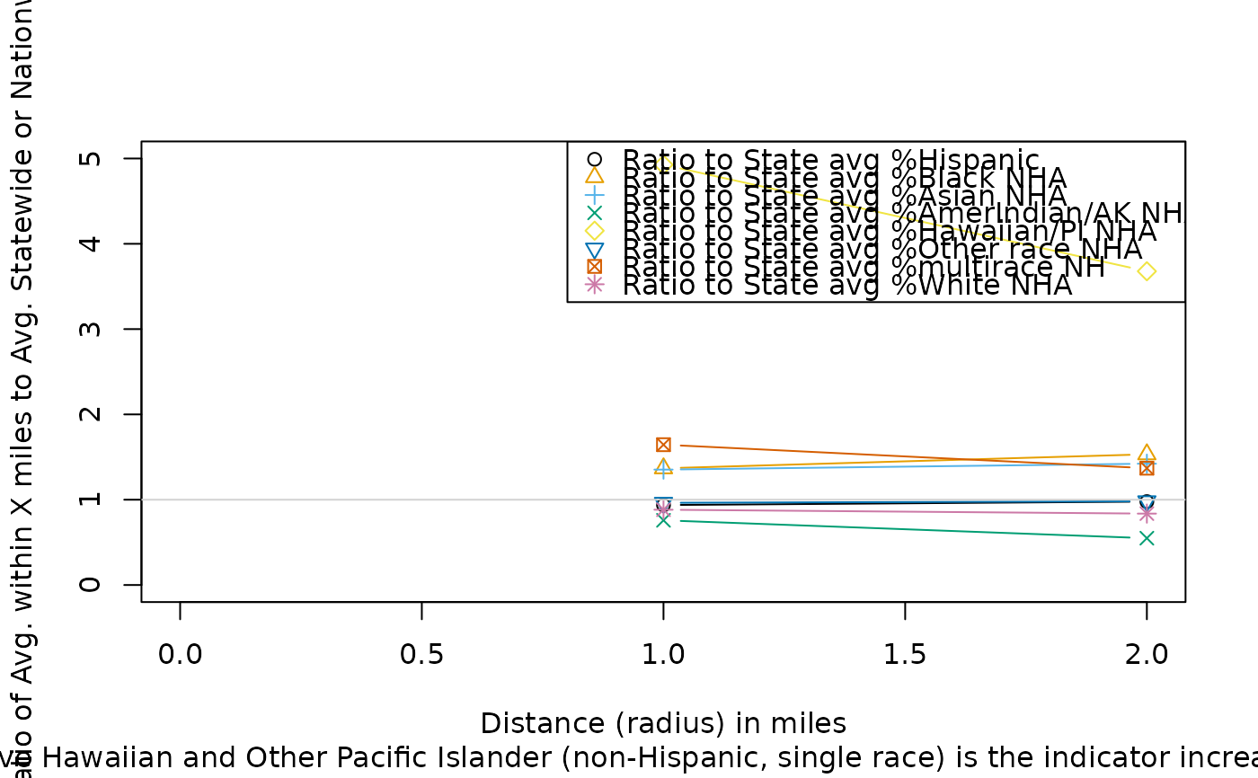 #> [1] "Ratio to State avg % Native Hawaiian and Other Pacific Islander (non-Hispanic, single race)"