Note: This article is a work in progress
HOW TO ANALYZE PROXIMITY USING EJAM
An outline of how to use key functions is provided below. After these examples is a discussion of background information and considerations in selecting radius.
Also see the list of functions related to comparing distances.
RESIDENTIAL POPULATION GROUP PERCENTAGES BY DISTANCE AT BLOCK GROUP RESOLUTION
It is easiest to analyze distance increments based on each blockgroup’s average resident here. Block resolution is covered in a later section.
WITHIN ONE RADIUS
Overall list of sites
At the OVERALL LIST of sites as a whole, which groups are over-represented within X mile radius vs Statewide?
out <- ejamit(testpoints_100, radius = 3.1)
ejam2ratios(out)
#>
#>
#> Average Resident in Place(s) Analyzed vs US or State
#>                       Ratio_to_US_avg Ratio_to_State_avg
#> Demog.Ind.                        1.2                1.2
#> Suppl Demog.Ind.                  1.0                1.0
#> %Low-inc.                         1.0                1.1
#> %Limited English                  1.6                1.2
#> %Unemployed                       1.1                1.1
#> %< High School                    1.2                1.1
#> %< age 5                          1.1                1.1
#> %> age 64                         0.8                0.8
#> %POC                              1.5                1.2
#> %Hispanic                         1.5                1.1
#> %Black NHA                        1.1                1.4
#> %Asian NHA                        2.5                1.4
#> %AmerIndian/AK NHA                0.5                0.6
#> %Hawaiian/PI NHA                  2.4                1.1
#> %Other race NHA                   1.3                1.1
#> %multirace NH                     1.1                1.0
#> %White NHA                        0.7                0.8
#> PM2.5                             1.2                1.1
#> Ozone                             1.1                1.0
#> NO2                               1.4                1.3
#> Diesel PM                         2.0                1.5
#> Toxic Releases to Air             0.5                1.0
#> Traffic                           2.6                1.7
#> %pre-1960                         1.4                1.3
#> NPL                               2.8                1.8
#> RMP                               1.3                1.2
#> TSDF                              3.3                1.8
#> UST                               1.7                1.7
#> NPDES                             0.1                2.1
#> Drinking                          2.5                3.0
ejam2barplot(out)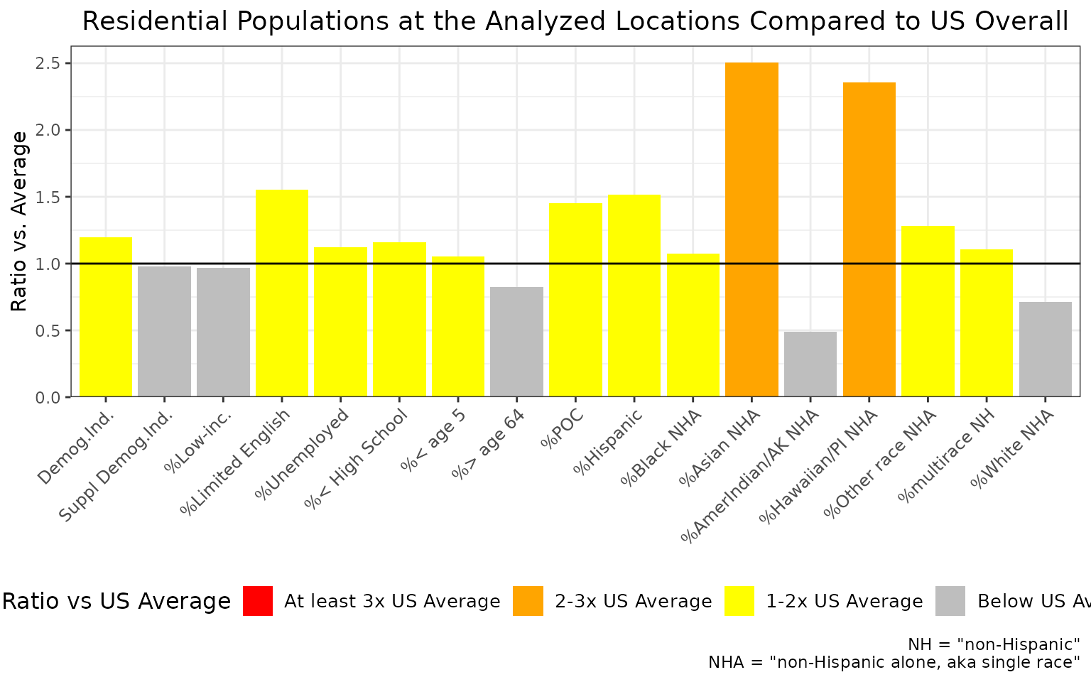
Example of ejam2barplot() showing percent Asian among residents within 5 km of these 100 sites is more than two times the US rate overall
Just one site
At JUST ONE SITE, which groups are over-represented within X mile radius vs Statewide?
out1 <- ejamit(testpoints_100[2, ], radius = 3.1)
ejam2ratios(out1)
ejam2barplot(out1)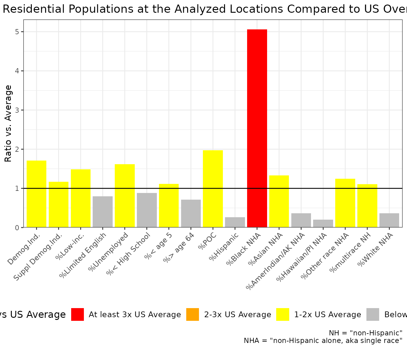
Example of ejam2barplot() showing percent non-Hispanic White Alone among residents within 5 km of this one site is about 1.6 times the US rate overall
Site by site comparison
Which groups are over-represented at EACH SITE, within X mile radius vs Statewide
out <- testoutput_ejamit_10pts_1miles
x = round(data.frame(out$results_bysite)[, c("ratio.to.state.avg.pctlowinc", "ratio.to.state.avg.pctmin")], 2)
names(x) = fixcolnames(names(x),"r","shortlabel")
x = data.frame(sitenumber = 1:NROW(x), x)
x
#>    sitenumber Ratio.to.State.avg..Low.inc. Ratio.to.State.avg..POC
#> 1           1                         0.56                    1.41
#> 2           2                         0.72                    0.58
#> 3           3                         0.81                    1.19
#> 4           4                         0.63                    0.39
#> 5           5                         1.44                    0.64
#> 6           6                         1.09                    0.84
#> 7           7                         1.25                    1.17
#> 8           8                         0.22                    0.69
#> 9           9                         0.49                    1.18
#> 10         10                         1.13                    1.19
Plot to compare sites, for just one residential population indicator
This plot shows that % low income among residents at sites 5 and 6 is more than twice the relevant State average. It is near average at several other sites, and is less than half the State average at sites 4 and 10.
ejam2barplot_sites(out, "ratio.to.state.avg.pctlowinc", topn = 10, sortby = F)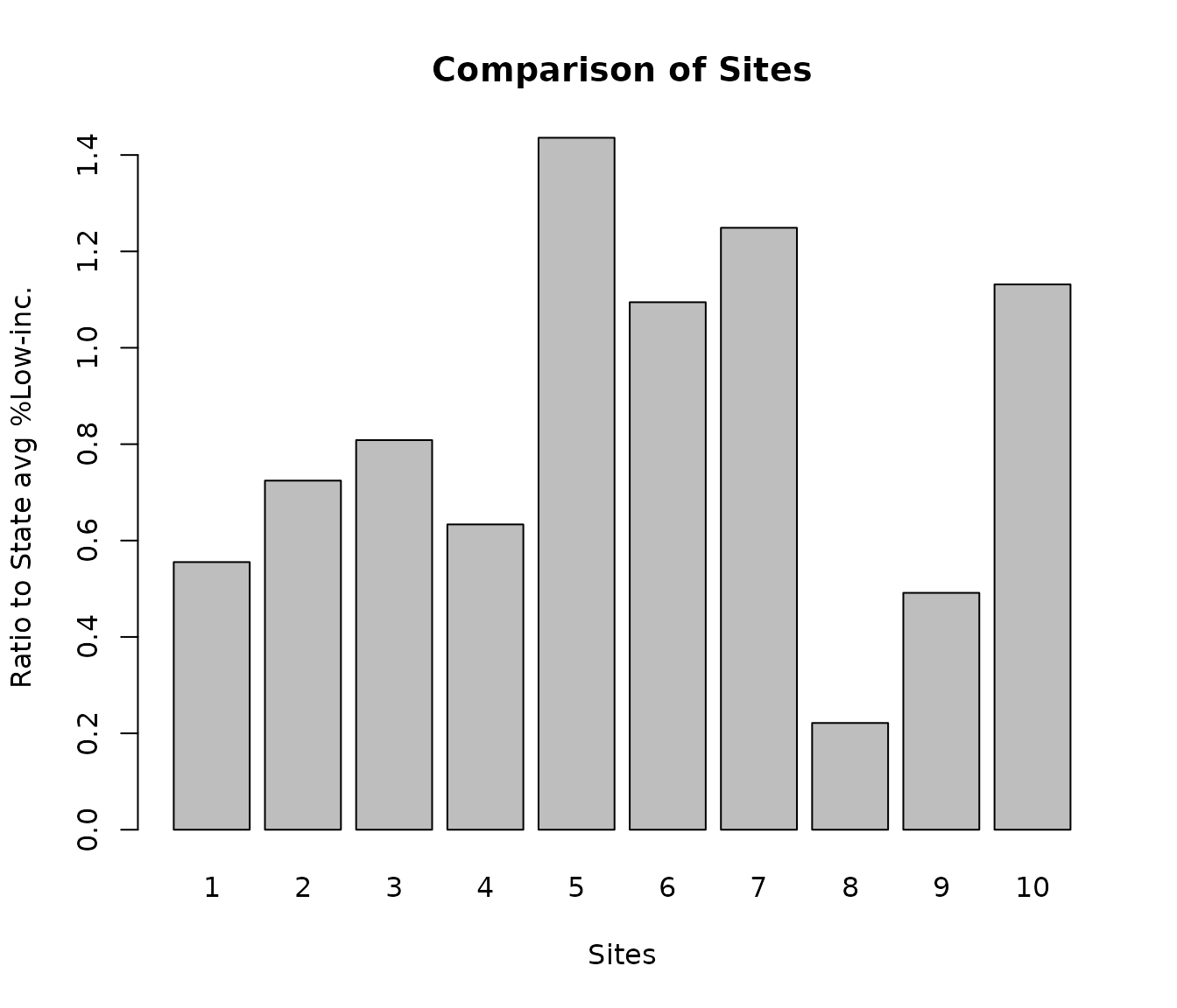
Example of ejam2barplot_sites()
## For raw values at key sites:
# ejam2barplot_sites(out, "pctlowinc")
WITHIN MULTIPLE DISTANCES - COMPARING RADIUS CHOICES
Overall list of sites
At the OVERALL LIST of sites as a whole, which groups are over-represented within X mile radius vs Statewide?
radii <- c(1,2,3,10)
#radii <- c(1, 10) #  quicker example
pts <- testpoints_100[10:12, ]
See just the table
x <- ejamit_compare_distances(pts, radii = radii, quiet = TRUE, plot = FALSE)#> Analyzing 3 points, radius of 1 miles around each.
#> doaggregate is predicted to take 24 seconds
#> Analyzing 3 points, radius of 2 miles around each.
#> doaggregate is predicted to take 24 seconds
#> Analyzing 3 points, radius of 3 miles around each.
#> doaggregate is predicted to take 24 seconds
#> Analyzing 3 points, radius of 10 miles around each.
#> doaggregate is predicted to take 24 seconds
#>
#> 1 2 3 10
#> Ratio to State avg %Hispanic 0.4 0.8 1.1 1.0
#> Ratio to State avg %Black NHA 4.4 2.7 1.8 0.7
#> Ratio to State avg %Asian NHA 1.5 1.5 1.5 1.4
#> Ratio to State avg %AmerIndian/AK NHA 0.2 0.2 0.4 0.5
#> Ratio to State avg %Hawaiian/PI NHA 0.8 1.6 1.3 1.0
#> Ratio to State avg %Other race NHA 0.7 0.9 0.7 0.7
#> Ratio to State avg %multirace NH 1.4 1.0 0.8 0.9
#> Ratio to State avg %White NHA 0.6 0.7 0.7 0.9See the plot
# x <- ejamit_compare_distances(pts, radii = radii, quiet = TRUE) # in which default is plot=TRUE
# or
ejam2barplot_distances(x)
#>
#> Indicators that increase the most as you get closer: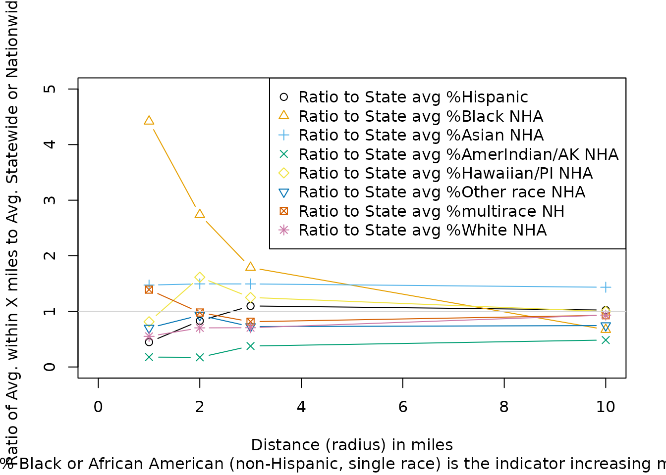
Example of using ejam2barplot_distances()
#> [1] "Ratio to State avg % Black or African American (non-Hispanic, single race)"RESIDENTIAL POPULATION GROUP DATA AT BLOCK GROUP RESOLUTION
Most of the EJAM functions use distance to the average resident of a block group, which is calculated from the distance to each block’s internal point and uses the approximation that within a block the average resident and all residents are as far as that internal point. For typical distances analyzed in EJAM (e.g., 3 mile radius, or about 5 km) that is a good approximation, since only about 2% of all US blocks are larger than 1 square mile.
If you need high spatial resolution (block by block) plots of an indicator as a function of distance, you can directly work with getblocksnearby() or just use the function plot_distance_by_pctd(). It uses the distance from the site to each block’s internal point (like a centroid) rather than just the distance to the average resident in each block group.
How residential population group percentages at ONE SITE vary as a continuous function of distance
Example of area where %Black is very high within 1 mile but drops by 3 miles away
pts <- testpoints_100[3,]
y <- plot_distance_by_pctd(
  getblocksnearby(pts, radius = 10, quiet = T),
  score_colname = "pctnhba",
  sitenumber = 1)
#> Analyzing 1 points, radius of 10 miles around each.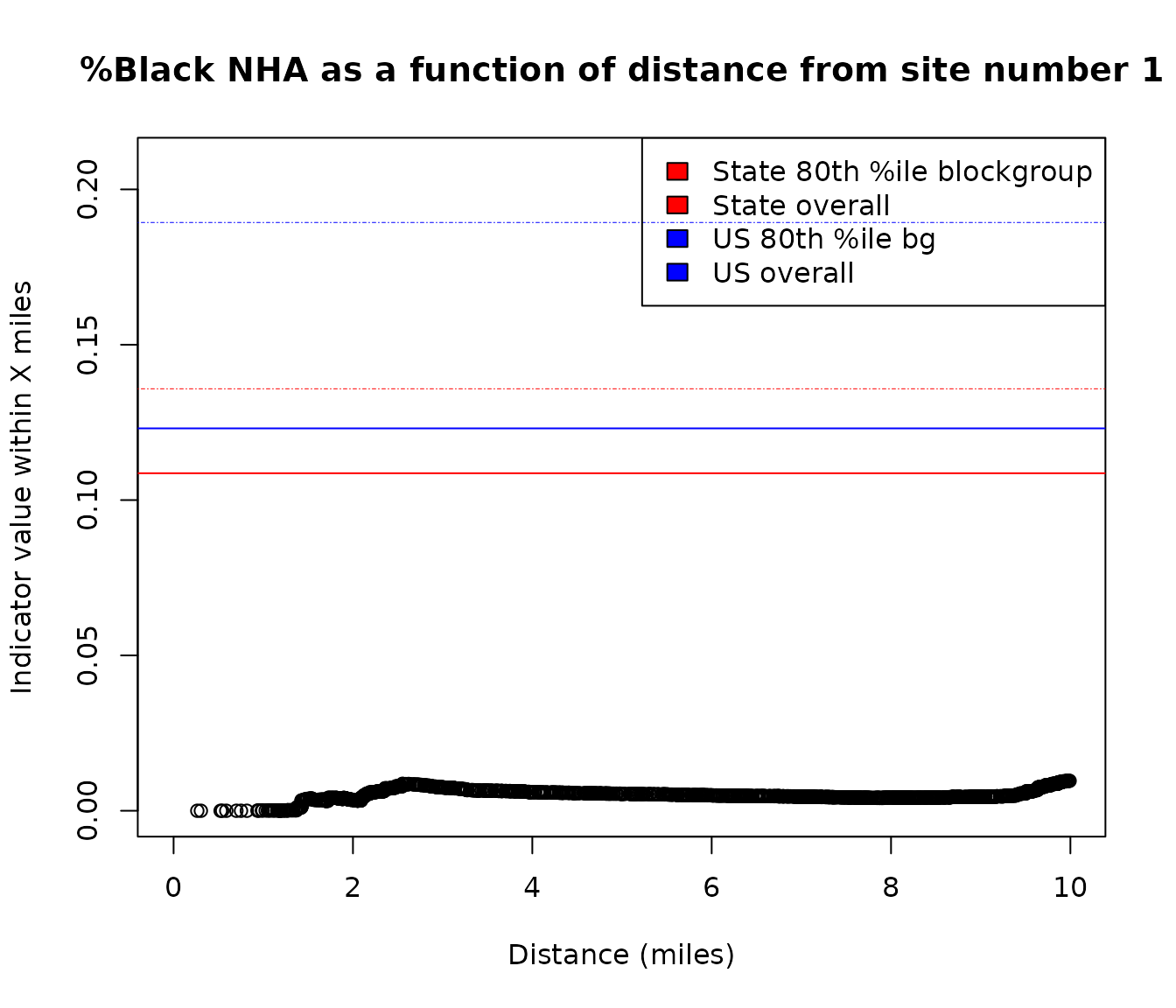
Example of using plot_distance_by_pctd()
#browseURL(url_ejscreen_report(lat = pts$lat, lon = pts$lon, radius = 0.5))
#browseURL(url_ejscreen_report(lat = pts$lat, lon = pts$lon, radius = 3))
Example of area that has higher %Hispanic as you go 10 to 30 miles away from this specific point
pts <- data.table::data.table(lat = 45.75464, lon = -94.36791)

y <- plot_distance_by_pctd(pts,
                      sitenumber = 1, score_colname = "pcthisp")
#> Analyzing 1 points, radius of 30 miles around each.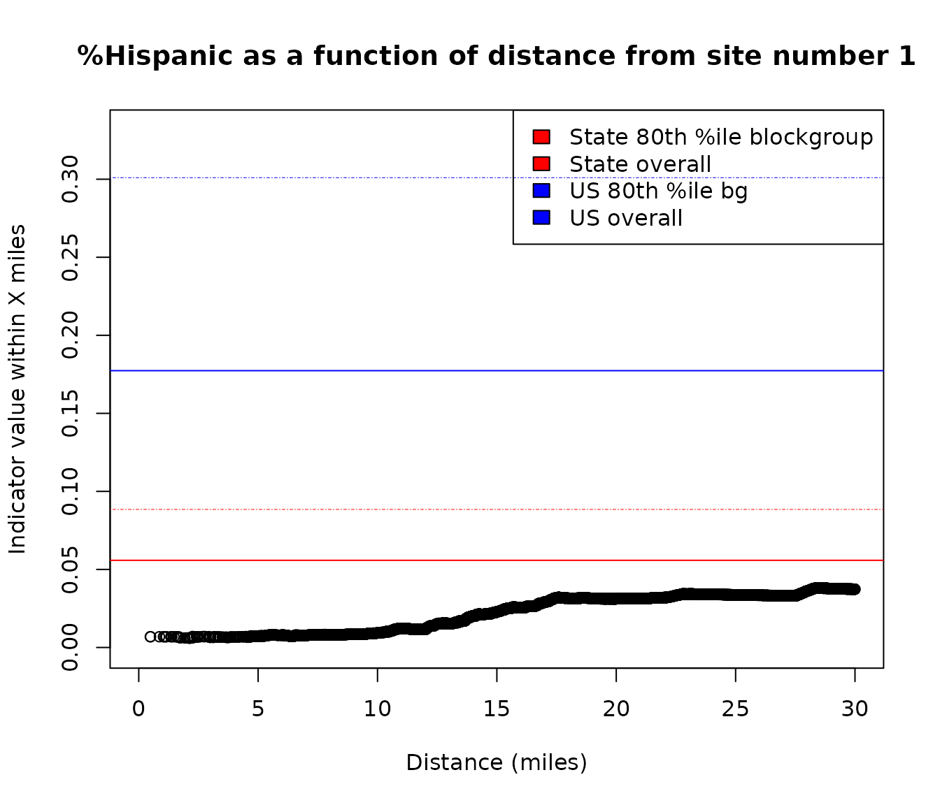
Example of using plot_distance_by_pctd()
# browseURL(url_ejscreen_report(lat = pts$lat, lon = pts$lon, radius = 10))
# browseURL(url_ejscreen_report(lat = pts$lat, lon = pts$lon, radius = 30))
Step through all the sites to see an indicator versus distance at each
Examples of sites analyzed here show some conclusions are very sensitive to the radius used. The choice of radius in proximity analysis for some sites will lead to a very different conclusion depending on the radius analyzed, if only a single distance is checked or reported on. The relationship between distance X and percent by residential population group within X miles can be positive, negative, or roughly flat, etc., depending on the site and group. The residential population group percentage may be above or below the US average or the State average within a given distance of the site.
For the ten sites analyzed in this example, a wide range of patterns is found:
At site 5, % low income is extremely high very close to the site and falls sharply with distance but it remains quite high (still above 80th percentile of US or State) even within 4 miles.
At site number 2 here, % low income very close to the site is around the 80th percentile in the State, and is around the US 80th percentile within about 1 mile, but then it falls to below State and then US average within around 2 and then 3 miles of the site.
At site 7, it is below average until about 8 miles, but is above US and State averages within 10 miles.
At site 9, it can be above or below average in State and/or in US, depending on the distance, but it is never as high as the 80th percentiles.
At sites 2, 3, 4, and 10, % low income is far below US and State averages within any distance shown here.
pts <- testpoints_10
s2b <- getblocksnearby(pts, radius = 10, quiet = T)
for (i in 1:NROW(pts)) {
  plot_distance_by_pctd(s2b, sitenumber = i, score_colname = "pctlowinc")
  readline() # hit any key to step through the plots
}
Block by block details are also easy to view in a map of all the
nearby blocks, as shown in the section on
plotblocksnearby() and details of blocks near one site.
Cumulative Distribution plots of groups as a continuous function of distance
Out of all the residents within the area analyzed, see how some are mostly nearby and others are further away, as a CDF plot. This shows the share of each residential population group residing at various distances from sites, with distance from nearest site on the x axis and the cumulative share of each group on the y axis (of all residents within 10 miles, what percent have a site within X miles?). It compares everyone nearby to just those who are among the percent low income, and shows that, for example, a larger share of all the low income population within 10 miles actually live within about 6 miles than is the case for everyone within 10 miles. In other words, within the 10 mile radius circles, more of the low income residents are closer to a site than are the non-low income residents or all residents.
 # out <- ejamit(testpoints_10, radius = 10)
plot_distance_cdf_by_group(
  out$results_bybg_people,
  demogvarname = 'pctlowinc', demoglabel = 'Low Income')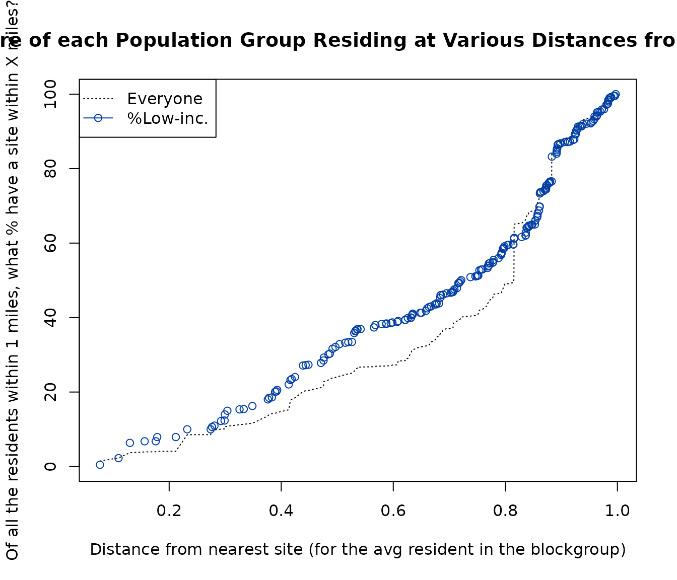
Example of using plot_distance_cdf_by_group()
MEAN DISTANCE BY RESIDENTIAL POPULATION GROUP
The analysis described above looks at residential population group percentages as a function of distance. Another perspective is provided by looking at distance as a function of residential population group. This means looking at the average distance or the whole distribution of distances (or proximities) among all the residents within a single residential population group, one group at a time, and comparing these groups.
Overall list of sites
Mean distance of each group, at the OVERALL LIST of sites as a whole
To see a table of residential population indicators, showing the mean distance for each group, compared to distance for those not in that residential population group:
out <- testoutput_ejamit_1000pts_1miles
## But try a larger radius to reveal more information:
# out <- ejamit(testpoints_100, radius = 10)

# see a table of demog indicators
distance_mean_by_group(out$results_bybg_people)
#>                               group nearest nearer ratio avg_distance_for_group
#> Demog.Ind.              Demog.Index   FALSE   TRUE 0.998                   0.69
#> Suppl Demog.Ind.   Demog.Index.Supp   FALSE   TRUE 0.997                   0.69
#> %Low-inc.                 pctlowinc   FALSE   TRUE 0.996                   0.69
#> %Limited English         pctlingiso   FALSE  FALSE 1.017                   0.70
#> %Unemployed           pctunemployed   FALSE   TRUE 1.000                   0.69
#> %< High School              pctlths   FALSE  FALSE 1.003                   0.69
#> %< age 5                  pctunder5   FALSE  FALSE 1.001                   0.69
#> %> age 64                 pctover64   FALSE  FALSE 1.007                   0.69
#> %POC                         pctmin   FALSE  FALSE 1.010                   0.69
#> %Hispanic                   pcthisp   FALSE  FALSE 1.013                   0.69
#> %Black NHA                  pctnhba   FALSE  FALSE 1.004                   0.69
#> %Asian NHA                  pctnhaa   FALSE   TRUE 1.000                   0.69
#> %AmerIndian/AK NHA       pctnhaiana    TRUE   TRUE 0.954                   0.66
#> %Hawaiian/PI NHA         pctnhnhpia   FALSE   TRUE 0.954                   0.66
#> %Other race NHA     pctnhotheralone   FALSE  FALSE 1.015                   0.70
#> %multirace NH            pctnhmulti   FALSE   TRUE 0.992                   0.68
#> %White NHA                  pctnhwa   FALSE   TRUE 0.990                   0.68
#>                    avg_distance_for_nongroup
#> Demog.Ind.                              0.69
#> Suppl Demog.Ind.                        0.69
#> %Low-inc.                               0.69
#> %Limited English                        0.69
#> %Unemployed                             0.69
#> %< High School                          0.69
#> %< age 5                                0.69
#> %> age 64                               0.69
#> %POC                                    0.68
#> %Hispanic                               0.69
#> %Black NHA                              0.69
#> %Asian NHA                              0.69
#> %AmerIndian/AK NHA                      0.69
#> %Hawaiian/PI NHA                        0.69
#> %Other race NHA                         0.69
#> %multirace NH                           0.69
#> %White NHA                              0.69

# for just 1 indicator
print(distance_mean_by_group(
  out$results_bybg_people,
  demogvarname = 'pctlowinc', demoglabel = 'Low Income'))
#>                group nearest nearer ratio avg_distance_for_group
#> Low Income pctlowinc    TRUE   TRUE 0.996                   0.69
#>            avg_distance_for_nongroup
#> Low Income                      0.69
To see a barplot, comparing just race/ethnicity groups:
plot_distance_mean_by_group(out$results_bybg_people,
                       demogvarname = names_d_subgroups,
                       demoglabel = fixcolnames(names_d_subgroups, "r", "shortlabel")
                       )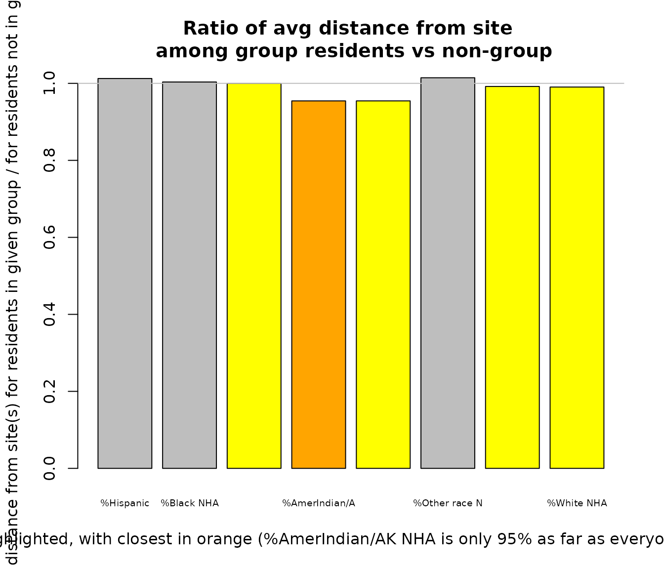
Example of using plot_distance_mean_by_group()
#>                              group nearest nearer ratio avg_distance_for_group
#> %Hispanic                  pcthisp   FALSE  FALSE 1.013                   0.69
#> %Black NHA                 pctnhba   FALSE  FALSE 1.004                   0.69
#> %Asian NHA                 pctnhaa   FALSE   TRUE 1.000                   0.69
#> %AmerIndian/AK NHA      pctnhaiana    TRUE   TRUE 0.954                   0.66
#> %Hawaiian/PI NHA        pctnhnhpia   FALSE   TRUE 0.954                   0.66
#> %Other race NHA    pctnhotheralone   FALSE  FALSE 1.015                   0.70
#> %multirace NH           pctnhmulti   FALSE   TRUE 0.992                   0.68
#> %White NHA                 pctnhwa   FALSE   TRUE 0.990                   0.68
#>                    avg_distance_for_nongroup
#> %Hispanic                               0.69
#> %Black NHA                              0.69
#> %Asian NHA                              0.69
#> %AmerIndian/AK NHA                      0.69
#> %Hawaiian/PI NHA                        0.69
#> %Other race NHA                         0.69
#> %multirace NH                           0.69
#> %White NHA                              0.69
Site by site comparison
Mean distance of each group, at EACH SITE, as ratio to mean of everyone else nearby
Ratios at each site, of avg dist of group / avg dist of everyone else near site:
out <- testoutput_ejamit_10pts_1miles
## But try a larger radius to reveal more information:
# out <- ejamit(testpoints_10, radius = 31)

x = distance_by_group_by_site(out$results_bybg_people)
x

# summary of closest group at each site and by how much
data.frame(site = colnames(x),
           closestgroup = rownames(x)[sapply(x, which.min)],
           their_avg_distance_as_pct_of_everyone_elses = round(100 * sapply(x, min, na.rm = TRUE), 0)
)
BACKGROUND AND OVERVIEW OF ISSUES IN PROXIMITY, DISTANCE, OR RADIUS
Distance from a potential source of environmental risk is often used as a simple proxy for actual exposure or risk, when data are limited. Proximity analysis uses distance (how far away) from a site, which is just the opposite of proximity (how near) to a site.
Conclusions can be sensitive to the choice of radius, if only one radius is reported on, as shown in [Step through all the sites to see an indicator versus distance at each].
Group’s percentage at each distance versus distance for each population group
Two basic ways to report residential population percentages and risk are 1) showing residential population percentage as a function or risk, and 2) showing risk as a function of residential population group:
Residential population group percentage as a function of risk (or proximity): Many proximity analyses report percentage by distance or risk bin, such as % low income within 3 miles of a point. This expresses residential population shares as a function of proximity or risk. Sometimes other distance or risk bins are used, such as areas with risk above some cutoff. And sometimes instead of a continuous measure of percentage, the residential population data are used to categorize places in bins, such as areas in the top quartile of poverty rates.
Risk (or proximity) as a function of residential population group: A different way to present this information is to report distance or risk as a function of residential population group – this expresses distance within each residential population group, such as the average distance by group or the full distribution of risk within each group.
Radius, radii, or continuous distance?
Proximity or distance as binary, categorical, or continuous metrics: Proximity analysis has often relied on picking a single distance, a radius, and analyzing conditions within that radius, such as all residents who live within 3 miles of a point where a regulated facility is located. Sometimes an analysis will look at two or even three distances. In some more sophisticated analyses, distance is treated as a continuous measure. Some tools like EJScreen use a proximity metric based on the inverse of distance (1/d) to provide a proximity score that gets higher as distance gets smaller. But many EJ analyses still use a single distance and analyze conditions within that distance.
EJAM makes it easier to do any of these types of analysis, because conclusions can be sensitive to the choice of a single radius, and metrics and methods provide different perspectives and reveal a richer picture of where people actually live in relation to potential sources of exposure or risk.
Comparisons within what distances or to what reference area(s)?
This is a tricky issue in proximity analysis: There is a subtle but vital difference between proximity analysis using a single radius (binary distance) and analysis using continuous distance. One way to think of this is that there are two aspects of or degrees of proximity to consider when analyzing residential population groups within a certain fixed distance (radius) from a single facility point (or a whole set of facilities). These two ways of summarizing proximity are complementary:
Which groups tend to live nearby in the sense of being within the radius versus outside the radius selected? In other words, which groups are “over-represented” within X miles of the site? This treats proximity as a yes/no, binomial question – a resident is nearby or not. It would focus on whether someone is anywhere within 3 miles, say, and ignore the differences between being 1, 2, or 3 miles away. Most proximity analysis has tended to look at this type of summary.
Among the residents within X miles of the site, which groups live especially close to the facility? This question recognizes proximity is a continuous variable, and focuses on the difference between 1 mile, 1.5 miles, etc. However, it only looks at residents within the X miles radius area analyzed, so it fails to recognize that some groups tend to live more than 3 miles away, for example. This perspective does not take into account which groups are over-represented within the original total radius near a site.
Some functions like distance_mean_by_group() or
distance_by_group_by_site() do the second of these two
types of analysis. They report, only among those anywhere inside the
radius, which groups are closer to the site.
In a specific location, for example, one residential population group could be underrepresented within 3 miles, but those few who are in the group still might live right next to the facility in which case their average distance would be higher than that of any other group because this function only counts those within the radius analyzed.
In some other location, the opposite could occur – if one group is over-represented within 3 miles, they still might all live in a community about 2.9 miles away from the site – that would mean their distance from the site on average is greater (or their proximity score is lower) than other groups within 3 miles of the site.
The question of whether to compare to Statewide or Nationwide or urban/rural or other reference averages or percentiles is related to this question of how to look at distances, or exposures or risk, just like it relates to how to look at residential population group percentages. One could look at percentage rate within 1 mile, 2 miles, etc. all the way out until one was looking at the county overall, the state overall, and eventually the nation overall. Selecting a single radius or selecting a single reference area should be done with a recognition of what questions one is actually trying to answer, and an understanding of how impacts vary with distance from a particular type of facility or source of potential risk.
If one is comparing residential population groups in terms of distance (or risk level), or if one is comparing % at each distance (or risk level), the implicit assumption is that there is some “expected” rate, and/or some “equitable” or “proportionate” % or ratio or risk.
CHOICE OF RADIUS AND UNCERTAINTY DUE TO A SMALL RADIUS WHERE BLOCKS ARE LARGE
Choosing a radius (or polygon) that is small relative to local Census blocks can lead to significant uncertainty in EJAM estimates, so it is important to understand the details if one wants to use a small radius especially in rural (low population density) areas.
To help consider this uncertainty, EJAM reports how many block centroids were found inside each area (inside a circular buffer defined by the selected radius, or inside a polygon that is from a shapefile). That count of blocks is found in a column of the spreadsheet output provided by the web app and also the table called results_bysite that is one output of the ejamit() function.
You could also Map all sites with popup at each saying how many blocks were found nearby and therefore might have more uncertainty in counts nearby.
# out <- ejamit(testpoints_1000, radius = 1)
# out$results_bysite$blockcount_near_site
out <- testoutput_ejamit_1000pts_1miles

barplot(
  table(cut(
    out$results_bysite$blockcount_near_site,
    c(-1, 9, 29, 100, 1000)
  )),
  names.arg = c("< 10 blocks", "10-29", "30-100", "> 100 blocks"),
  main = "How many blocks are within 1 mile of these 1,000 facilities?",
  ylab = "# of facilities",
  xlab = "# of blocks nearby"
)
For more details about distance adjustments, overlaps of circles, etc.
This function prints a very large amount of diagnostic information, and provides a barplot histogram showing in this case that almost none of the 1000 sites have zero blocks within a mile but roughly 10-15% have under 10 blocks nearby and a similar share have only 10-29 blocks nearby.
# (Printed information is lengthy)

  getblocks_diagnostics(
  testoutput_getblocksnearby_1000pts_1miles,
  # getblocksnearby(testpoints_1000, radius = 1, quiet = T),
  detailed = T, see_pctiles = T
  )
Suggestions on radius and uncertainty
Here are some suggestions about how to consider the radius in relation to uncertainty where blocks are large:
- A closer look at uncertainty and care in communicating uncertainty may be needed where a circle or polygon contains fewer than about 30 block centroids. That is especially important if it contains fewer than about 10, and essential if it contains only 1 or zero block centroids.
- Using a radius of 5 miles or more does not raise these issues in 99% of US locations where EPA-regulated facilities are found.
- A radius of 3 miles might need a closer look for about 1% to 5% of typical sites in the US.
- A radius of 1 mile or less requires caution and understanding of the issues at a significant share of locations in the US (about 1 in 4 locations might need a closer look to check for uncertainties).
- A 0.5 mile radius should not be used without cautious interpretation or offline analysis in most locations where EPA-regulated facilities are located.
- A 0.25 mile radius should only be used on a case-by-case basis where each location is examined individually and other methods are likely more suited for the analysis of those sites.
These considerations are explained further in the discussion below.
Residential population group counts and percentages or environmental indicators are calculated from block group residential population data and environmental indicators and an estimate of what fraction of each block group is inside each site. For proximity analysis that means a circle is drawn around a point using a radius, and for shapefiles a similar approach is used. In either case, the fraction of the block group counted as inside the area analyzed is based on which block centroids (each is technically called a block “internal point”) are inside the circle or polygon. All the residents of a block are assumed to be inside if the block centroid is inside. This is exactly true unless a block is on the edge of the circle or polygon. Even for the ones on the edge, some centroids are just outside and some just inside the shape, so the contributions of some blocks are over-counted and other under-counted, but those tend to cancel each other out in the sense that it is unlikely they would all be under-counted, for example. Still, when a large share of the block points in circle or polygon are from blocks not entirely inside, uncertainty is higher than when the vast majority of blocks are entirely inside. In other words, if the circle or polygon has a very large number of blocks in it, uncertainty is lower because only a small fraction are along the edge and bisected. If a radius of 3 miles is used, the area is 28 square miles. If the blocks in that location are only about 0.28 square miles each, the circle might contain or partly contain about 100 blocks.
The dataset used by EJAM called blockwts has a column called block_radius_miles that is what the radius would be if the block were circular, and it was created based on area = pi * block_radius_miles^2 or block_radius_miles = sqrt(area / pi) where area is in square miles.
Details on the blocks found near one site
Table of distances between each site and each block
Use getblocksnearby() to quickly find residents/blocks
that are within a specified distance, as a table of distances between
sites and nearby blocks.
sitepoints <- testpoints_10[1:2, ]

sites2blocks <- getblocksnearby(
  sitepoints = sitepoints,
  radius = 3.1
)
#> Analyzing 2 points, radius of 3.1 miles around each.
#> Finding Census blocks with internal point within  3.1  miles of the site (point), for each of 2  sites (points)...
#> Stats via getblocks_diagnostics(), but NOT ADJUSTING UP FOR VERY SHORT DISTANCES:
#> min distance before adjustment:  0.02554516
#> max distance before adjustment:  6.299561
head(sites2blocks)
#> Key: <blockid>
#>    ejam_uniq_id blockid distance    blockwt  bgid distance_unadjusted
#>           <int>   <int>    <num>      <num> <int>               <num>
#> 1:            1  917797 3.004690 0.06443071 32583            3.004690
#> 2:            1  917798 3.008581 0.03795234 32583            3.008581
#> 3:            1  917799 2.958068 0.06884378 32583            2.958068
#> 4:            1  917800 2.911103 0.04942630 32583            2.911103
#> 5:            1  917801 2.935066 0.05560459 32583            2.935066
#> 6:            1  917802 2.840296 0.12444837 32583            2.840296
Detailed stats on blocks found near site(s)
x <- getblocks_diagnostics(sites2blocks)
#>
#>    DISTANCES FROM BLOCKS (AND RESIDENTS) TO SITES (AND FOR CLOSEST SITE)
#>
#> 3.099399 miles is max. distance to block internal point (distance_unadjusted)
#> 3.099399 miles is max. distance to average resident in block (distance reported)
#> 0.02554516 miles is shortest distance to block internal point (distance_unadjusted)
#> 0.02554516 miles is shortest distance to average resident in block (distance reported)
#> 0 block distances were adjusted (these stats may count some blocks twice if adjusted at 2+ sites)
#>   0 block distances were adjusted up (reported dist to avg resident is > dist to block internal point)
#>   0 block distances were adjusted down (reported < unadjusted)
#> 0 unique sites had one or more block distances adjusted due to large block and short distance to block point
#>
#>   BLOCK COUNTS PER SITE (FEWER MEANS HIGHER UNCERTAINTY AT THOSE SITES)
#>
#> 651 blocks are near the avg site or in avg buffer
#> (based on their block internal point, like a centroid)
#>
#>   sites    blocks_per_site
#> 1     0         Not even 1
#> 2     0       some but <10
#> 3     0              10-29
#> 4     2 at least 30 blocks
#>
#>   BLOCK COUNTS TOTAL AND IN OVERLAPS OF AREAS (MULTIPLE SITES FOR SOME RESIDENTS)
#>
#> 1,302 actual unique blocks total
#> 1,302 blocks including double-counting in overlaps,
#>              in final row count (block-to-site pairs table)
#> 1 is ratio of blocks including multicounting / actual count of unique blocks
#> 0% of unique blocks could get counted more than once
#>              because those residents are near two or more sites
#>              (assuming they live at the block internal point
#>
#>   SITE COUNTS TOTAL AND IN OVERLAPS OF AREAS (MULTIPLE SITES FOR SOME RESIDENTS)
#>
#> 2 unique output sites
#>
#> 1,302 blocks (and their residents) have exactly 1 site nearby
#> 0 blocks (and their residents) have exactly 2 sites nearby
#> 0 blocks (and their residents) have exactly 3 sites nearby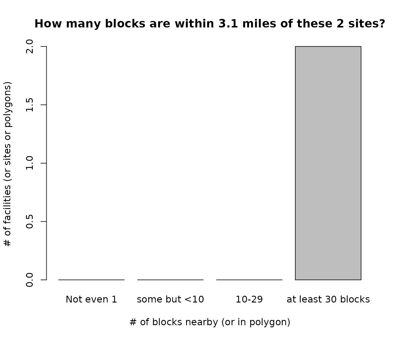
Example of getblocks_diagnostics() to see tables and histogram barplot of how many blocks are within 3.1 miles of these 2 sites
# x <- getblocks_summarize_blocks_per_site(sites2blocks)
# print(x) shows more info returned invisibly
Map 1 site to inspect the blocks nearby
Clicking on a block point provides a popup window showing information such as this:
blockfips: 131850102031056
blockid: 1788737
blocklat: 30.9913730000001
blocklon: -83.3753460999999
distance: 1.03614020347595
distance_unadjusted: 1.03614020347595
blockwt: 0
blockpop: 0
pop_nearby: 6237
bgpop: 1281
bgfips: 131850102031
bgid: 64286
ejam_uniq_id: 1
blockcount_near_site: 219
x <- plotblocksnearby(testpoints_10[1, ], radius = 3, returnmap = F)
#> Analyzing 1 points, radius of 3 miles around each.
#> Finding Census blocks with internal point within  3  miles of the site (point), for each of 1  sites (points)...
#> Stats via getblocks_diagnostics(), but NOT ADJUSTING UP FOR VERY SHORT DISTANCES:
#> min distance before adjustment:  0.07738988
#> max distance before adjustment:  5.904633
# Set returnmap= TRUE to actually return a leaflet map
POPULATION DENSITY – WHY THE AVG SITE AND AVG RESIDENT ARE SO DIFFERENT
Reporting EJAM information summarized for the average site gives very different answers than reporting on the average resident near any one or more of those sites. The average site and average resident are completely different because most of the residents live near just a few of the sites – the ones with higher population density – when one is using a fixed radius at all sites, such as 3 miles from each site. Taking the average of sites gives equal weight to each site, even the ones with very few residents around them. Taking the average of all residents near all the sites gives equal weight to each person, so conditions near certain sites affect more people and have more influence on that average.
Sites vary widely in count of blocks nearby, depending on population density (which is closely related to block area in square miles)
- what blocks are near each site
- how far are they
- how many blocks are typically near a given site (population density varies)
- how many sites are near a block (residents with > 1 site nearby)
out <- testoutput_ejamit_100pts_1miles
cat("  ", popshare_p_lives_at_what_pct(out$results_bysite$pop, p = 0.50, astext = TRUE), "\n")
#>    12% of places account for 50% of the total population (approx.)
cat("  ", popshare_at_top_n(out$results_bysite$pop, c(1, 5, 10), astext = TRUE), "\n\n")
#>    1, 5, 10 places account for 10%, 28%, 43% of the total population
Find all blocks nearby each site
radius <- 3
sitepoints <- testpoints_100
sites2blocks <- getblocksnearby(sitepoints, radius, quadtree = localtree, quiet = TRUE)
#> Analyzing 100 points, radius of 3 miles around each.
# testoutput_getblocksnearby_10pts_1miles is also available as an example
names(sites2blocks)
#> [1] "ejam_uniq_id"        "blockid"             "distance"
#> [4] "blockwt"             "bgid"                "distance_unadjusted"
Very few blocks are within a radius of 1/4 mile.
Hundreds are often within 1 mile, but sometimes there are only a handful or even zero.
library(data.table)

s2b_stats <- sites2blocks[ , .(
  avgDistance = round(mean(distance), 2),
  blocksfound = .N,
  blocks_within_1mile = sum(distance <= 1),
  blocks_within_0.75   = sum(distance <= 0.75),
  blocks_within_0.25  = sum(distance <= 0.25)
), by = 'ejam_uniq_id'][order(blocksfound), ]

setorder(s2b_stats, ejam_uniq_id)
head(s2b_stats)
#>    ejam_uniq_id avgDistance blocksfound blocks_within_1mile blocks_within_0.75
#>           <int>       <num>       <int>               <int>              <int>
#> 1:            1        1.52        1493                 470                307
#> 2:            2        1.82        3842                 651                375
#> 3:            3        2.02         448                  18                 10
#> 4:            4        1.97         182                  14                 11
#> 5:            5        1.95         575                  59                 32
#> 6:            6        1.87         274                  24                  4
#>    blocks_within_0.25
#>                 <int>
#> 1:                 20
#> 2:                 53
#> 3:                  1
#> 4:                  2
#> 5:                  3
#> 6:                  0
Histogram and table showing how many blocks are nearby a site
hist(sites2blocks[,.N, by = "ejam_uniq_id"][, N], 20,
     xlab = "How many blocks are nearby?",
     ylab = "Frequency (# of sites)",
     main = "A given site may have zero to hundreds of blocks nearby",
     sub = "A typical site in this example has about 100 blocks nearby")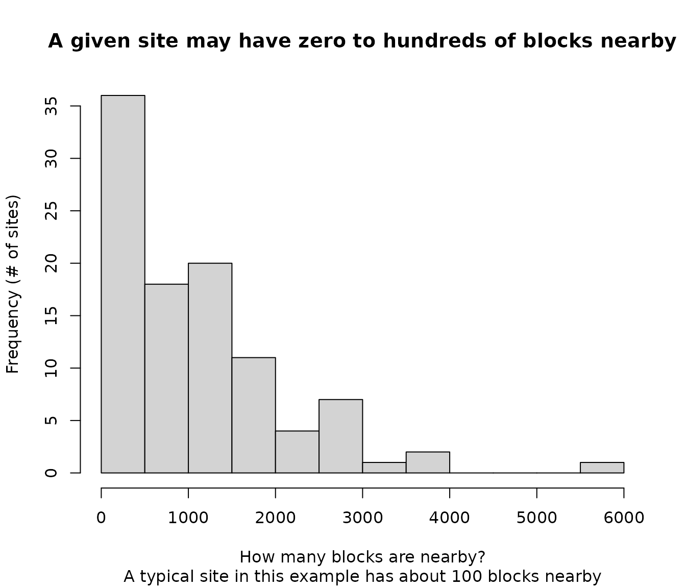
Example of Histogram and table showing how many blocks are within 3 miles of a site
DT::datatable(s2b_stats,  rownames = FALSE)
# more summaries showing there may be only 1 block or hundreds within 1 mileMap all sites with popup at each saying how many blocks were found nearby
## done previously:
# radius <- 3
# sitepoints <- testpoints_100

out <- ejamit(sitepoints = sitepoints,
              radius = radius, include_ejindexes = F)
#> Finding blocks nearby.
#> Analyzing 100 points, radius of 3 miles around each.
#> Aggregating at each site and overall.
#> doaggregate is predicted to take 24 seconds
#> Warning in batch.summarize(sitestats = out$results_bysite, popstats =
#> out$results_bybg_people, : specified threshnames not all found in sitestats
#> colnames or other problem with thresholds or threshgroups, so using defaults

few <- out$results_bysite$blockcount_near_site < 30

mapthis <- cbind(
  sitepoints,
  out$results_bysite[, c(
    "pop", "bgcount_near_site", "blockcount_near_site"
    )],
  NOTE = ifelse(few, "< 30 blocks here", "")
  )

# Show in red the sites with very few blocks nearby, suggesting more uncertainty in residential population group counts

mm <- mapfast(mapthis, radius = radius, color = 'navy')
mm |> leaflet::addCircles(
    lng = mapthis$lon[few],
    lat = mapthis$lat[few],
    color = "red", radius = radius * 2 * meters_per_mile,
    popup = popup_from_any(mapthis[few, ])
)
Example of mapfast() for seeing how many blocks are at each site
Some places have hundreds nearby: a 1 mile radius is huge within a dense urban area
head(s2b_stats[order(s2b_stats$blocks_within_1mile, decreasing = T),
               c('ejam_uniq_id', 'blocks_within_1mile')], 3)
#>    ejam_uniq_id blocks_within_1mile
#>           <int>               <int>
#> 1:           89                 749
#> 2:            2                 651
#> 3:            1                 470
densest <- s2b_stats$ejam_uniq_id[order(
  s2b_stats$blocks_within_1mile, decreasing = T)][1]
leastdense <- s2b_stats$ejam_uniq_id[order(
    s2b_stats$blocks_within_1mile, decreasing = F)][1]
#> Analyzing 1 points, radius of 3 miles around each.
#> Finding Census blocks with internal point within 3 miles of the site (point), for each of 1 sites (points)...
#> Stats via getblocks_diagnostics(), but NOT ADJUSTING UP FOR VERY SHORT DISTANCES:
#> min distance before adjustment: 0.03130003
#> max distance before adjustment: 5.053461
plotblocksnearby(sitepoints = sitepoints[densest, ])#> Analyzing 1 points, radius of 3 miles around each.
#> Finding Census blocks with internal point within 3 miles of the site (point), for each of 1 sites (points)...
#> Stats via getblocks_diagnostics(), but NOT ADJUSTING UP FOR VERY SHORT DISTANCES:
#> min distance before adjustment: 1.059524
#> max distance before adjustment: 4.755771
plotblocksnearby(sitepoints = sitepoints[ leastdense, ])Within a 1 mile radius, the blocks found tend to be about 2/3 of a mile from the site at the center.
summary(s2b_stats$avgDistance)
#>    Min. 1st Qu.  Median    Mean 3rd Qu.    Max.
#>   0.830   1.815   1.930   1.873   2.005   2.230