Compare EJAM results overall for more than one radius Run ejamit() once per radius, get a summary table with a row per radius
Source:R/ejamit_compare_distances.R
ejamit_compare_distances.RdCompare EJAM results overall for more than one radius Run ejamit() once per radius, get a summary table with a row per radius
Arguments
- sitepoints
like for
ejamit()- radii
optional, vector of radius values like 1:3 for
ejamit()- donuts_not_cumulative
optional, when implemented, if set TRUE, would return results on areas in each "donut" or ring that is a distance bin, such as for
0 < R <= radii[1] radii[1] < R <= radii[2]etc.- quiet
optional, passed to
ejamit()- silentinteractive
optional, passed to
ejamit()- plot
optional logical, set FALSE to avoid plotting
- myvars
optional, for plot, see default value
- ylab
optional, for plot, see default value
- ylim
optional, for plot, see default value
- n
optional, how many of the indicators to report on (printed to console), when reporting which indicators most strongly increase as radius decreases.
- ...
optional, passed to
ejamit()
Value
data.table you can call results_bydistance, like ejamit()$results_overall but with one row per radius
Examples
radii <- c(convert_units(5,"km","miles"), convert_units(50,"km","miles"))
radii <- 1:10
radii <- c(1, 10)
pts <- testpoints_100
pts <- testpoints_10
bydist <- ejamit_compare_distances(pts, radii = radii)
#> Analyzing 10 points, radius of 1 miles around each.
#> doaggregate is predicted to take 24 seconds
#> Analyzing 10 points, radius of 10 miles around each.
#> doaggregate is predicted to take 24 seconds
#>
#> 1 10
#> Ratio to State avg %Hispanic 0.9 1.2
#> Ratio to State avg %Black NHA 1.4 1.4
#> Ratio to State avg %Asian NHA 1.4 1.7
#> Ratio to State avg %AmerIndian/AK NHA 0.8 0.7
#> Ratio to State avg %Hawaiian/PI NHA 4.9 1.7
#> Ratio to State avg %Other race NHA 1.0 1.5
#> Ratio to State avg %multirace NH 1.6 1.2
#> Ratio to State avg %White NHA 0.9 0.7
#>
#> Indicators that most strongly get larger as you get closer:
#>
#> Indicators that increase the most as you get closer:
#>
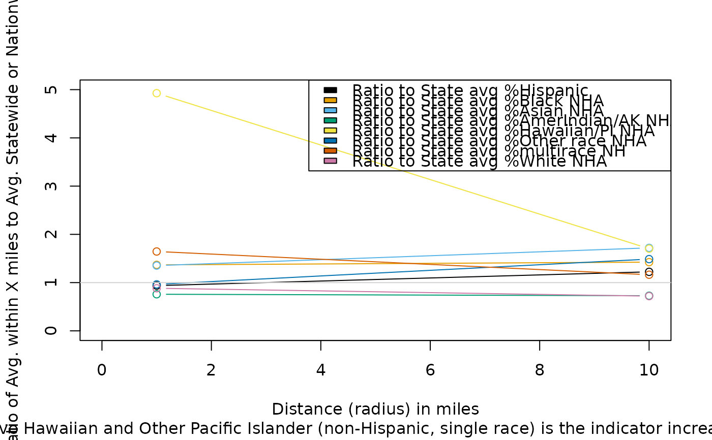 #> [1] "Ratio to State avg % Native Hawaiian and Other Pacific Islander (non-Hispanic, single race)"
ejamit_compare_distances2plot(bydist, myvars = c(
"ratio.to.avg.pctlowinc", "ratio.to.avg.pcthisp", "ratio.to.avg.pctnhba"))
#> Error in ejamit_compare_distances2plot(bydist, myvars = c("ratio.to.avg.pctlowinc", "ratio.to.avg.pcthisp", "ratio.to.avg.pctnhba")): could not find function "ejamit_compare_distances2plot"
names(bydist) <- fixcolnames(names(bydist), "r", "shortlabel")
#> [1] "Ratio to State avg % Native Hawaiian and Other Pacific Islander (non-Hispanic, single race)"
ejamit_compare_distances2plot(bydist, myvars = c(
"ratio.to.avg.pctlowinc", "ratio.to.avg.pcthisp", "ratio.to.avg.pctnhba"))
#> Error in ejamit_compare_distances2plot(bydist, myvars = c("ratio.to.avg.pctlowinc", "ratio.to.avg.pcthisp", "ratio.to.avg.pctnhba")): could not find function "ejamit_compare_distances2plot"
names(bydist) <- fixcolnames(names(bydist), "r", "shortlabel")