This chapter describes the different ways in which the results of an
analysis as well as the basic network input data can be viewed. These
include different map views, graphs, tables, and special reports.
There are several ways in which database values and results of a
simulation can be viewed directly on the Network Map:
For the current settings on the Map Browser (see Section 4.7), the
nodes and links of the map will be colored according to the color-
coding used in the Map Legends (see Section 7.7). The map’s coloring
will be updated as a new time period is selected in the Browser.
When the Flyover Map Labeling program preference is selected (see
Section 4.9), moving the mouse over any node or link will display its
ID label and the value of the current viewing parameter for that node
or link in a hint-style box.
ID labels and viewing parameter values can be displayed next to all
nodes and/or links by selecting the appropriate options on the
Notation page of the Map Options dialog form (see Section 7.9).
Nodes or links meeting a specific criterion can be identified by
submitting a Map Query (see below).
You can animate the display of results on the network map either
forward or backward in time by using the Animation buttons on the Map
Browser. Animation is only available when a node or link viewing
parameter is a computed value (e.g., link flow rate can be animated
but diameter cannot).
The map can be printed, copied to the Windows clipboard, or saved as
a DXF file or Windows metafile.
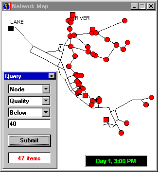
Submitting a Map Query
A Map Query identifies nodes or links on the network map that meet a
specific criterion (e.g., nodes with pressure less than 20 psi, links
with velocity above 2 ft/sec). An example of a map query is provided in Fig. 9.1.
Analysis results, as well as some design parameters, can be viewed
using several different types of graphs. Graphs can be printed,
copied to the Windows clipboard, or saved as a data file or Windows
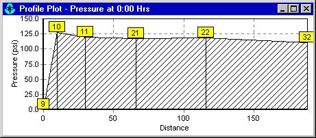
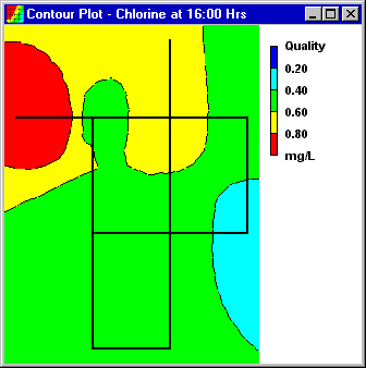
metafile. Table 9.1 lists the types of graphs that can be used to view values
for a selected parameter.
Table 9.1 Types of Graphs Available to View Results
TYPE OF PLOT
DESCRIPTION
APPLIES TO
Time Series Plot
Plots value versus
time
Specific nodes or
links over all time
periods
Profile Plot
Plots value versus
distance
A list of nodes at a
specific time
Contour Plot
Shows regions of the
map where values fall
within specific
intervals
All nodes at a
specific time
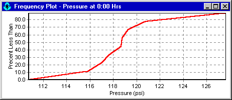
Frequency Plot
Plots value versus
fraction of objects
at or below the value
All nodes or links at
a specific time
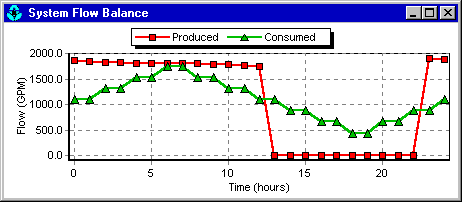
System Flow
Plots total system
production and
consumption versus
time
Water demand for all
nodes over all time
periods
Note: When only a single node or link is graphed in a Time Series
Plot the graph will also display any measured data residing in a
Calibration File that has been registered with the project (see
Section 5.3).
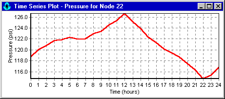
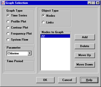
Fig. 9.2 is an example of a time series plot that shows the pressure at node 22 for different times in the analysis.
Selects a time period to graph
(does not apply to Time Series
plots)
Object Type
Selects either Nodes or Links
(only Nodes can be graphed on
Profile and Contour plots)
Items to Graph
Selects items to graph (applies
only to Time Series and Profile
plots)
Time Series plots and Profile plots require one or more objects be
selected for plotting. To select items into the Graph Selection
dialog for plotting:
Select the object (node or link) either on the Network Map or on the
Data Browser. (The Graph Selection dialog will remain visible during
this process).
Click the Add button on the Graph Selection dialog to add the
selected item to the list.
In place of Step 2, you can also drag the object’s label from the
Data Browser onto the Form’s title bar or onto the Items to Graph
list box.
Table 9.3 lists the other buttons on the
Graph Selection dialog form and how they are used.
Make the graph the active window (click on its title bar).
Select Report >> Options, or click on the Standard
Toolbar, or right-click on the graph.
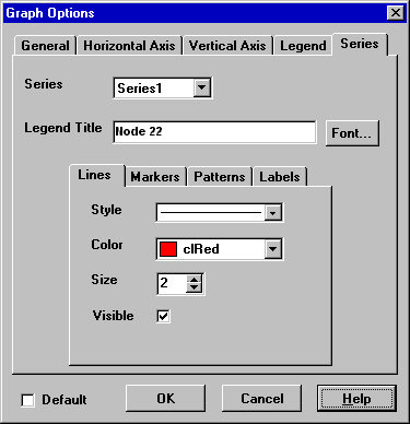
For a Time Series, Profile, Frequency or System Flow plot, use the
resulting Graph Options dialog (Fig. 9.8) to customize the graph’s
appearance.
For a Contour plot use the resulting Contour Options dialog to
customize the plot.
Note: A Time Series, Profile, or Frequency plot can be zoomed by
holding down the Shift key while drawing a zoom rectangle with the
mouse’s left button held down. Drawing the rectangle from left to
right zooms in, drawing from right to left zooms out. The plot can
also be panned in any direction by holding down the Ctrl key and
moving the mouse across the plot with the right button held down.
Selects line
thickness (only
for solid line
style).
Visible
Determines if line
is visible.
Markers
Style
Selects marker
style.
Color
Selects marker
color.
Size
Selects marker
size.
Visible
Determines if
marker is visible.
Patterns
Style
Selects pattern
style.
Color
Selects pattern
color.
Stacking
Not used with
EPANET.
Labels
Style
Selects what type
of information is
displayed in the
label.
Color
Selects the color
of the label’s
background.
Transparent
Determines if
graph shows
through label or
not.
Show Arrows
Determines if
arrows are
displayed on pie
charts.
Visible
Determines if
labels are visible
or not.
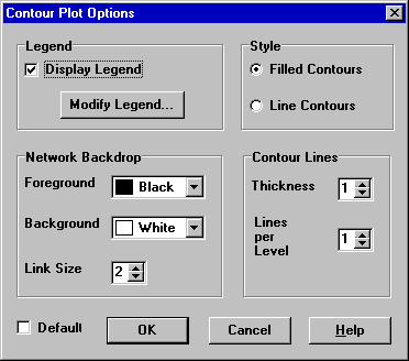
The Contour Options dialog form (Fig. 9.9) is used to customize the
appearance of a contour graph. A description of each option is
provided in Table 9.8.
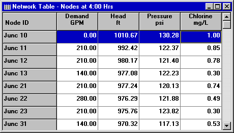
Select View >> Table or click on the Standard Toolbar.
Use the Table Options dialog box that appears to select:
The type of table
The quantities to display in each column
Any filters to apply to the data
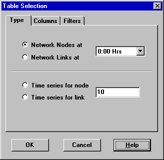
The Table Selection options dialog form has three tabs as shown in
Fig. 9.11. All three tabs are available when a table is first
created. After the table is created, only the Columns and Filters
tabs will appear. The options available on each tab are as follows:
The Type tab of the Table Options dialog is used to select the type
of table to create. The choices are:
All network nodes at a specific time period
All network links at a specific time period
All time periods for a specific node
All time periods for a specific link
Data fields are available for selecting the time period or node/link
to which the table applies.
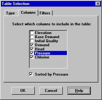
Columns Tab
The Columns tab of the Table Options dialog form (Fig. 9.12)
selects the parameters that are displayed in the table’s columns.
Click the checkbox next to the name of each parameter you wish to
include in the table, or if the item is already selected, click in
the box to deselect it. (The keyboard’s Up and Down Arrow keys can be
used to move between the parameter names, and the spacebar can be
used to select/deselect choices).
To sort a Network-type table with respect to the values of a
particular parameter, select the parameter from the list and check
off the Sorted By box at the bottom of the form. (The sorted
parameter does not have to be selected as one of the columns in the
table.) Time Series tables cannot be sorted.
Fig. 9.12 Columns Tab of the Table Selection Dialog.
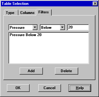
Filters Tab
The Filters tab of the Table Options dialog form (Fig. 9.13) is
used to define conditions for selecting items to appear in a table.
To filter the contents of a table:
Use the controls at the top of the page to create a condition (e.g., Pressure Below 20).
Click the Add button to add the condition to the list.
Use the Delete button to remove a selected condition from the list.
Fig. 9.13 Filters Tab of the Table Selection Dialog.
Multiple conditions used to filter the table are connected by AND’s.
If a table has been filtered, a re-sizeable panel will appear at the
bottom indicating how many items have satisfied the filter
conditions.
Once a table has been created, you can add/delete columns or sort or
filter its data:
Select Report >> Options or click on the Standard
Toolbar or right-click on the table.
Use the Columns and Filters pages of the Table Selection dialog form
to modify your table.
In addition to graphs and tables, EPANET can generate several other
specialized reports. These include:
Status Report
Energy Report
Calibration Report
Reaction Report
Full Report
All of these reports can be printed, copied to a file, or copied to
the Windows clipboard (the Full Report can only be saved to file.)
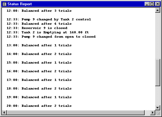
Status Report
EPANET writes all error and warning messages generated during an
analysis to a Status Report (see Fig. 9.14). Additional information
on when network objects change status and a final mass balance accounting
for water quality analysis are also written to this report
if the Status Report option in the project’s Hydraulics Options was
set to Yes or Full. For pressure driven analysis, node demand deficiency will also be reported in the status report.
To view a status report on the most recently
completed analysis select Report >> Status from the main menu.
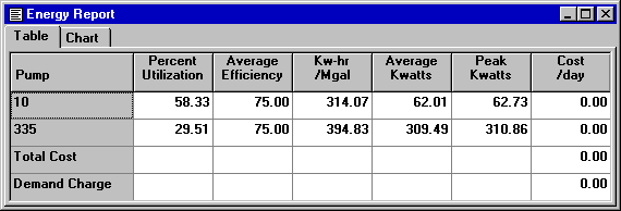
EPANET can generate an Energy Report that displays statistics about
the energy consumed by each pump and the cost of this energy usage
over the duration of a simulation (see Fig. 9.15). To generate an
Energy Report select Report >> Energy from the main menu. The
report has two tabs, Table and Chart. One displays energy usage by pump in a
tabular format. The second compares a selected energy statistic
between pumps using a bar chart.
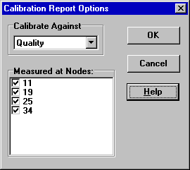
A Calibration Report can show how well EPANET’s simulated results
match measurements taken from the system being modeled. To create a
Calibration Report:
First make sure that Calibration Data for the quantity being
calibrated has been registered with the project (see Section 5.3).
Select Report >> Calibration from the main menu.
In the Calibration Report Options form that appears (see Fig. 9.16):
Select a parameter to calibrate against
Select the measurement locations to use in the report
After the report is created the Calibration Report Options form can
be recalled to change report options by selecting Report >>
Options or by clicking on the Standard Toolbar when the
report is the current active window in EPANET’s workspace.
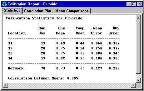
A sample Calibration Report is shown in Fig. 9.17. It contains
three tabbed pages: Statistics, Correlation Plot, and Mean
Comparisons.
The Statistics tab of a Calibration Report lists various error
statistics between simulated and observed values at each measurement
location and for the network as a whole. If a measured value at a
location was taken at a time in-between the simulation’s reporting
time intervals then a simulated value for that time is found by
interpolating between the simulated values at either end of the
interval.
The statistics listed for each measurement location are:
Number of observations
Mean of the observed values
Mean of the simulated values
Mean absolute error between each observed and simulated value
Root mean square error (square root of the mean of the squared errors
between the observed and simulated values)
These statistics are also provided for the network as a whole (i.e.,
all measurements and model errors pooled together). Also listed is
the correlation between means (correlation coefficient between the
mean observed value and mean simulated value at each location).
Correlation Plot Tab
The Correlation Plot tab of a Calibration Report displays a scatter
plot of the observed and simulated values for each measurement made
at each location. Each location is assigned a different color in the
plot. The closer that the points come to the 45-degree angle line on
the plot the closer is the match between observed and simulated
values.
Mean Comparisons Tab
The Mean Comparisons tab of a Calibration Report presents a bar
chart that compares the mean observed and mean simulated value for a
calibration parameter at each location where measurements were taken.
Reaction Report
A Reaction Report, available when modeling the fate of a reactive
water quality constituent, graphically depicts the overall average
reaction rates occurring throughout the network in the following
locations:
The bulk flow
The pipe wall
Within storage tanks
A pie chart shows what percent of the overall reaction rate is
occurring in each location. The chart legend displays the average
rates in mass units per hour. A footnote on the chart shows the
inflow rate of the reactant into the system.
The information in the Reaction Report can show at a glance what
mechanism is responsible for the majority of growth or decay of a
substance in the network. For example, if one observes that most of
the chlorine decay in a system is occurring in the storage tanks and
not at the walls of the pipes then one might infer that a corrective
strategy of pipe cleaning and replacement will have little effect in
improving chlorine residuals.
A Graph Options dialog box can be called up to modify the appearance
of the pie chart by selecting Report >> Options or by clicking
on the Standard Toolbar, or by right-clicking anywhere on
the chart.
Full Report
When the icon appears in the Run Status section of the
Status Bar, a report of computed results for all nodes, links and
time periods can be saved to file by selecting Full from the
Report menu. This report, which can be viewed or printed outside
of EPANET using any text editor or word processor, contains the
following information:
Project title and notes
A table listing the end nodes, length, and diameter of each link
A table listing energy usage statistics for each pump
A pair of tables for each time period listing computed values for
each node (demand, head, pressure, and quality) and for each link
(flow, velocity, headloss, and status)
This feature is useful mainly for documenting the final results of a
network analysis on small to moderately sized networks (full report
files for large networks analyzed over many time periods can easily
consume dozens of megabytes of disk space). The other reporting tools
described in this chapter are available for viewing computed results
on a more selective basis.
on the Map Toolbar.
on the Standard Toolbar.
on the Standard Toolbar, or right-click on the graph.
on the Standard Toolbar.
icon appears in the Run Status section of the Status Bar, a report of computed results for all nodes, links and time periods can be saved to file by selecting Full from the Report menu. This report, which can be viewed or printed outside of EPANET using any text editor or word processor, contains the following information: