Graphics#
WNTR includes several functions to plot water network models and to plot fragility curves, pump curves, tank curves, and valve layers.
Networks#
Basic network graphics can be generated using the
function plot_network.
A wide range of options can be supplied, including
node attributes, node size, node range,
link attributes, link width, and link range.
Node and link attributes can be specified using the following options:
Name of the attribute (i.e., ‘elevation’ for nodes or ‘length’ for links), this calls
query_node_attributeorquery_link_attributemethod on the water network model and returns a pandas Series with node/link names and associated valuesPandas Series with node/link names and associated values, this option is useful to show simulation results (i.e.,
results.node['pressure'].loc[5*3600, :]) and metrics (i.e.,wntr.metrics.population(wn))Dictionary with node/link names and associated values (similar to pandas Series)
List of node/link names (i.e.,
['123', '199']), this highlights the node or link in red
The following example plots the network along with node elevation (Figure 27).
Note that the plot_network function returns a matplotlib axes object
which can be further customized by the user.
>>> import wntr

>>> wn = wntr.network.WaterNetworkModel('Net3')
>>> ax = wntr.graphics.plot_network(wn, node_attribute='elevation',
...    node_colorbar_label='Elevation (m)')
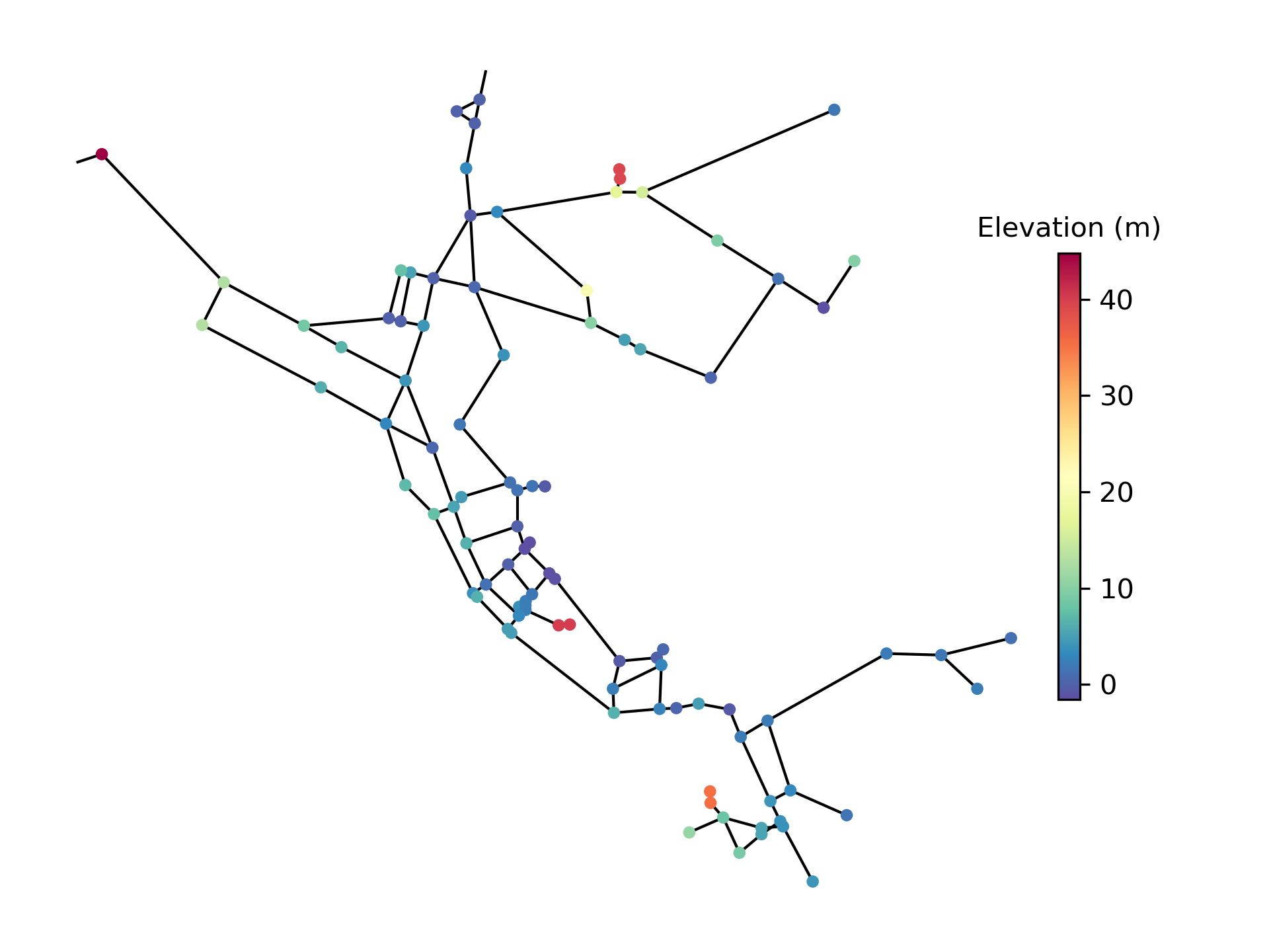
Figure 27 Basic network graphic.#
Additional network plot examples are included below (Figure 28). This includes the use of data stored as a Pandas Series (pipe velocity from simulation results), a dictionary (the length of the five longest pipes), and a list of strings (tank names). The example also combines multiple images into one figure using subplots and changes the colormap from the default Spectral_r to viridis in one plot. See https://matplotlib.org for more colormap options.
>>> sim = wntr.sim.EpanetSimulator(wn)
>>> results = sim.run_sim()
>>> velocity = results.link['velocity'].loc[3600,:]
>>> print(velocity.head())
name
20     0.039
40     0.013
50     0.004
60     2.824
101    1.320
Name: 3600, dtype: float32

>>> length = wn.query_link_attribute('length')
>>> length_top5 = length.sort_values(ascending=False)[0:5]
    >>> length_top5 = length_top5.round(2).to_dict()
>>> print(length_top5)
{'329': 13868.4, '101': 4328.16, '137': 1975.1, '169': 1389.89, '204': 1380.74}

>>> tank_names = wn.tank_name_list
>>> print(tank_names)
['1', '2', '3']

>>> fig, axes = plt.subplots(1, 3, figsize=(15, 5))
>>> ax = wntr.graphics.plot_network(wn, link_attribute=velocity,
...    title='Pipe velocity at hour 1', link_colorbar_label='Velocity (m/s)', ax=axes[0])
>>> ax = wntr.graphics.plot_network(wn, link_attribute=length_top5, link_width=2,
...    title='Longest 5 pipes', link_cmap = plt.cm.viridis,
...    link_colorbar_label='Pipe length (m)', ax=axes[1])
>>> ax = wntr.graphics.plot_network(wn, node_attribute=tank_names,
...    title='Location of tanks', ax=axes[2])
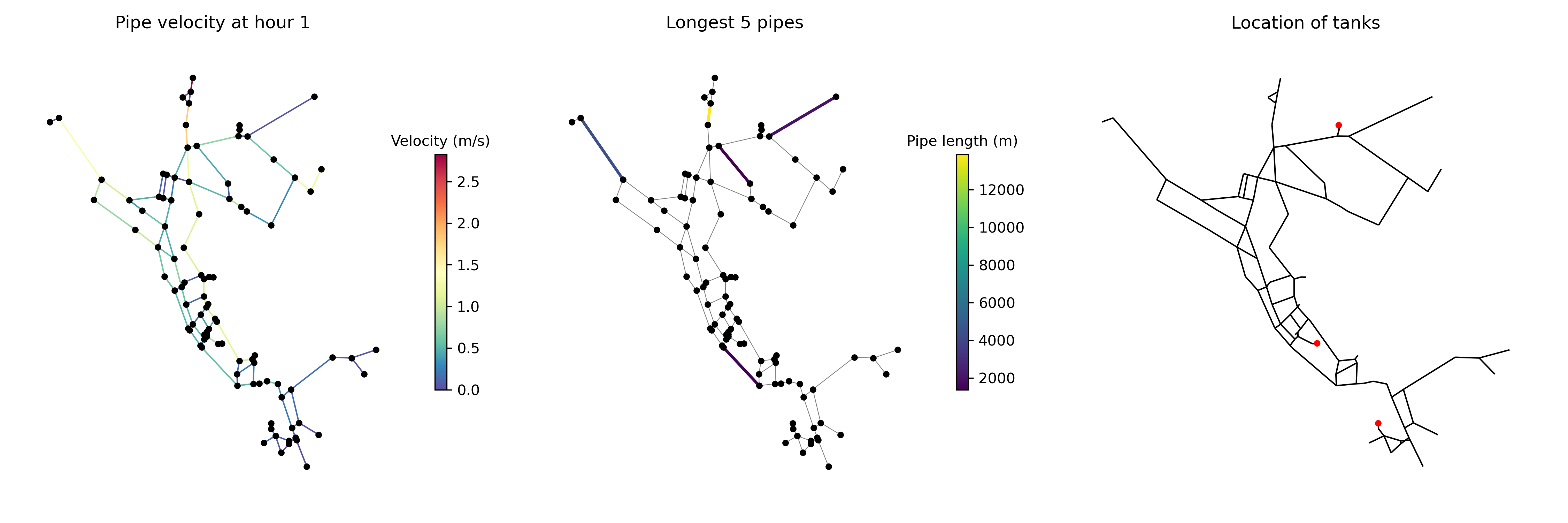
Figure 28 Additional network graphics.#
Interactive plotly networks#
Interactive plotly network graphics can be generated using the
function plot_interactive_network.
This function produces an HTML file that the user can pan, zoom, and hover-over network elements.
As with basic network graphics, a wide range of plotting options can be supplied.
However, link attributes currently cannot be displayed on the graphic.
Note
This function requires the Python package plotly [27], which is an optional dependency of WNTR.
The following example plots the network along with node population (Figure 29).
>>> pop = wntr.metrics.population(wn)
>>> wntr.graphics.plot_interactive_network(wn, node_attribute=pop,
...    node_range=[0,500], filename='population.html', auto_open=False)
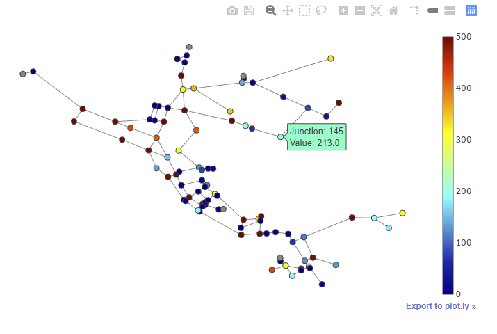
Figure 29 Interactive network graphic with the legend showing the node population.#
Interactive Leaflet networks#
Interactive Leaflet network graphics can be generated using the
function plot_leaflet_network.
This function produces an HTML file that overlays the network model onto a Leaflet map. Leaflet is an open-source JavaScript library for mobile-friendly interactive maps. More information on Leaflet is provided at https://leafletjs.com/.
The network model should have coordinates in longitude/latitude.
See Modify node coordinates for more information on converting node coordinates.
As with basic network graphics, a wide range of plotting options can be supplied.
Note
This function requires the Python package folium [22], which is an optional dependency of WNTR.
The following example using EPANET Example Network 3 (Net3) converts node coordinates to longitude/latitude and plots the network along with pipe length over the city of Albuquerque (for demonstration purposes only) (Figure 30). The longitude and latitude for two locations are needed to plot the network. For the EPANET Example Network 3, these locations are the reservoir ‘Lake’ and node ‘219’. This example requires the Python package utm [4] to convert the node coordinates.
>>> longlat_map = {'Lake':(-106.6851, 35.1344), '219': (-106.5073, 35.0713)}
>>> wn2 = wntr.morph.convert_node_coordinates_to_longlat(wn, longlat_map)
>>> length = wn2.query_link_attribute('length')
>>> wntr.graphics.plot_leaflet_network(wn2, link_attribute=length, link_width=3,
...                                    link_range=[0,1000], filename='length.html')
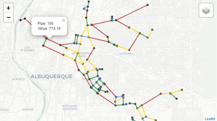
Figure 30 Interactive Leaflet network graphic.#
Network animation#
Network animation can be generated using the
function network_animation. Node and link attributes can be specified using pandas DataFrames, where the
index is time and columns are the node or link name.
The following example creates a network animation of water age over time.
The node_range parameter indicates the minimum and maximum values to use
when mapping colors to node_attribute values.
>>> wn.options.quality.parameter = 'AGE'
>>> sim = wntr.sim.EpanetSimulator(wn)
>>> results = sim.run_sim()
>>> water_age = results.node['quality']/3600 # convert seconds to hours
>>> anim = wntr.graphics.network_animation(wn, node_attribute=water_age,
...     node_range=[0,24])
Time series#
Time series graphics can be generated using options available in Matplotlib and pandas.
The following example plots simulation results from above, showing pressure at a single node over time (Figure 31).
>>> pressure_at_node123 = results.node['pressure'].loc[:,'123']
>>> ax = pressure_at_node123.plot()
>>> text = ax.set_xlabel("Time (s)")
>>> text = ax.set_ylabel("Pressure (m)")
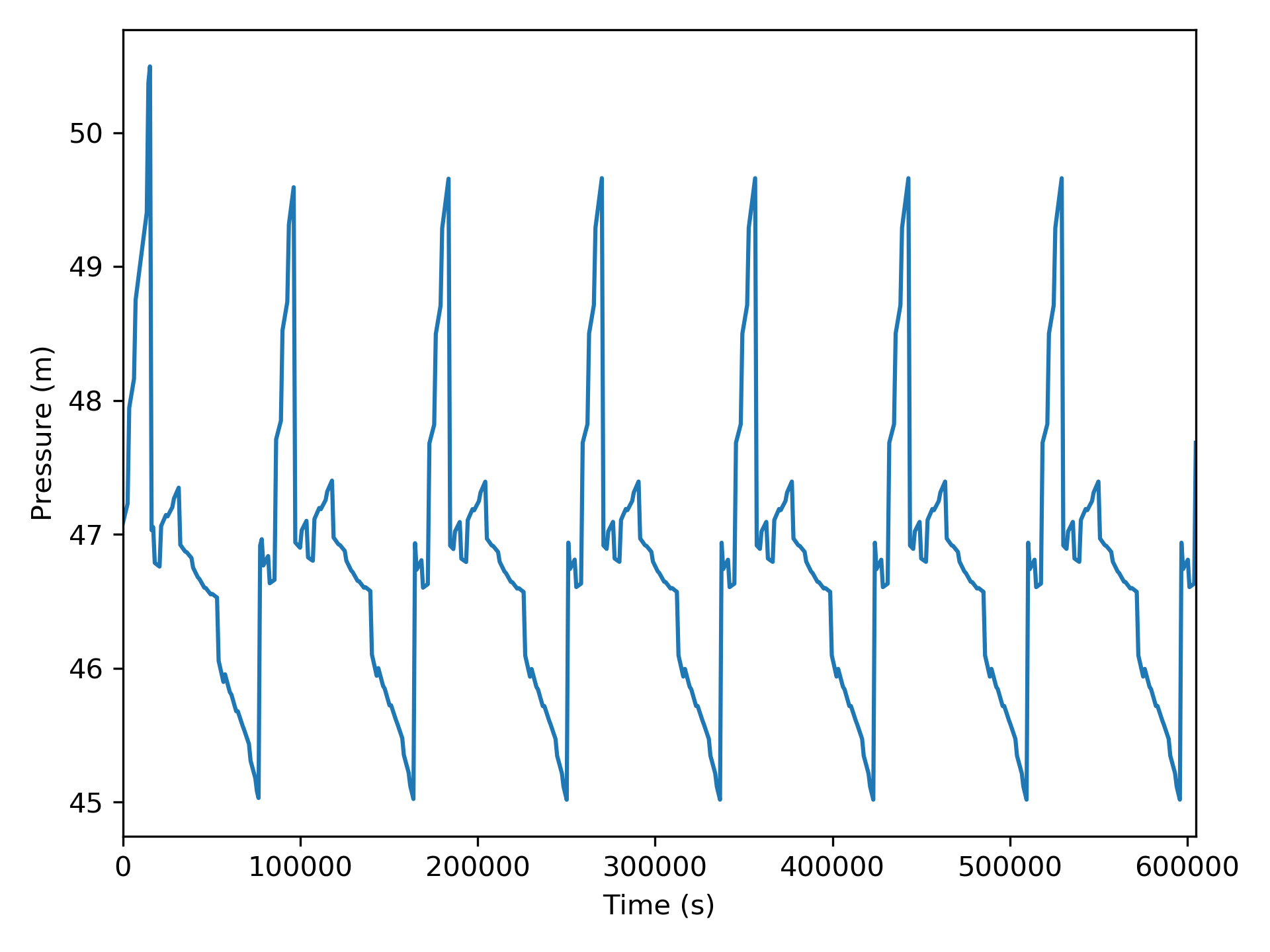
Figure 31 Time series graphic.#
Interactive time series#
Interactive time series graphics are useful when visualizing large datasets.
Basic time series graphics can be converted to interactive time series graphics using the plotly.express module.
Note
This functionality requires the Python package plotly [27], which is an optional dependency of WNTR.
The following example uses simulation results from above, and converts the graphic to an interactive graphic (Figure 32).
>>> import plotly.express as px

>>> tankH = results.node['pressure'].loc[:,wn.tank_name_list]
>>> tankH = tankH * 3.28084 # Convert tank head to ft
>>> tankH.index /= 3600 # convert time to hours
>>> fig = px.line(tankH)
>>> fig = fig.update_layout(xaxis_title='Time (hr)', yaxis_title='Head (ft)',
...                   template='simple_white', width=650, height=400)
>>> fig.write_html('tank_head.html')
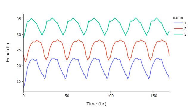
Figure 32 Interactive time series graphic with the tank heights for Tank 1 (blue), Tank 2 (orange), and Tank 3 (green).#
Fragility curves#
Fragility curves can be plotted using the
function plot_fragility_curve.
The following example plots a fragility curve with two states (Figure 33).
>>> from scipy.stats import lognorm

>>> FC = wntr.scenario.FragilityCurve()
>>> FC.add_state('Minor', 1, {'Default': lognorm(0.5,scale=0.3)})
>>> FC.add_state('Major', 2, {'Default': lognorm(0.5,scale=0.7)})
>>> ax = wntr.graphics.plot_fragility_curve(FC, xlabel='Peak Ground Acceleration (g)')
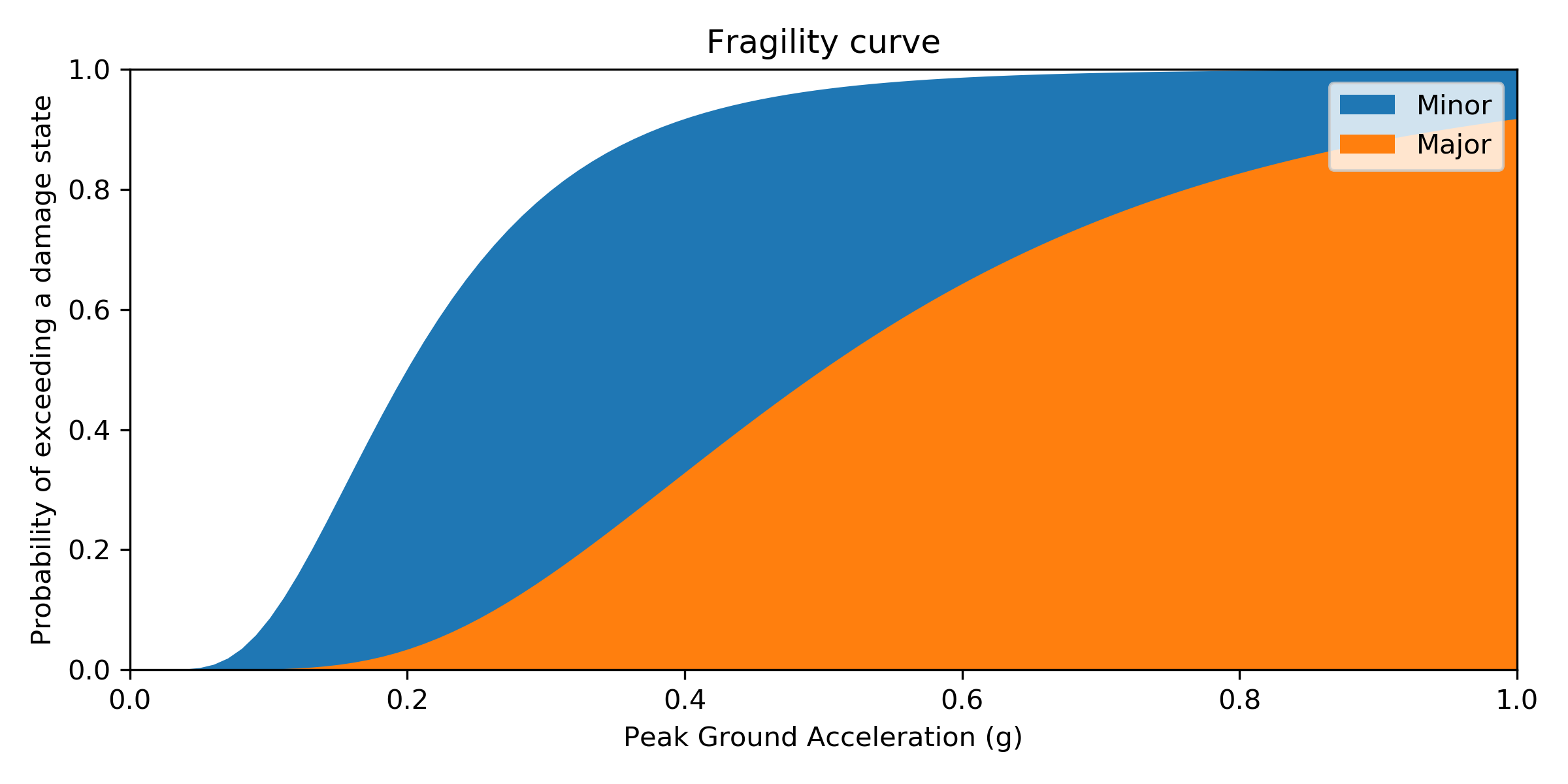
Figure 33 Fragility curve graphic.#
Pump curves#
Pump curves can be plotted using the
function plot_pump_curve.
By default, a 2nd order polynomial is included in the graphic.
The following example plots a pump curve (Figure 34).
>>> pump = wn.get_link('10')
>>> ax = wntr.graphics.plot_pump_curve(pump)
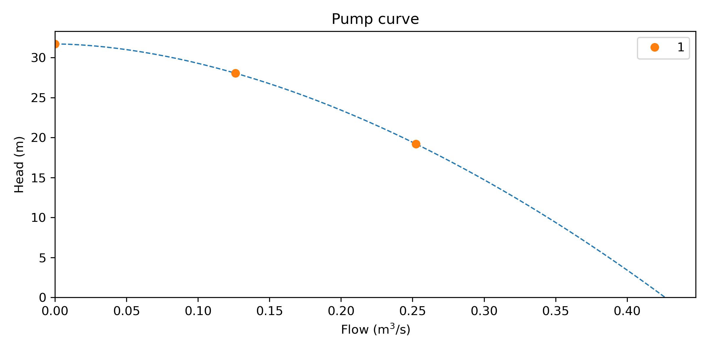
Figure 34 Pump curve graphic.#
Tank volume curves#
Tank curves and profiles can be plotted using the
function plot_tank_volume_curve.
The following example creates a tank curve and then plots the curve and corresponding tank profile (Figure 35). The profile is plotted as a stairstep line between points. The minimum and maximum level of the tank is included in the figure.
>>> wn.add_curve('Curve', 'VOLUME', [
...    (1,  0),
...    (2,  60),
...    (3,  188),
...    (4,  372),
...    (5,  596),
...    (6,  848),
...    (7,  1114),
...    (8,  1379),
...    (9,  1631),
...    (10, 1856),
...    (11, 2039),
...    (12, 2168),
...    (13, 2228)])
>>> tank = wn.get_node('2')
>>> tank.vol_curve_name = 'Curve'
>>> ax = wntr.graphics.plot_tank_volume_curve(tank)
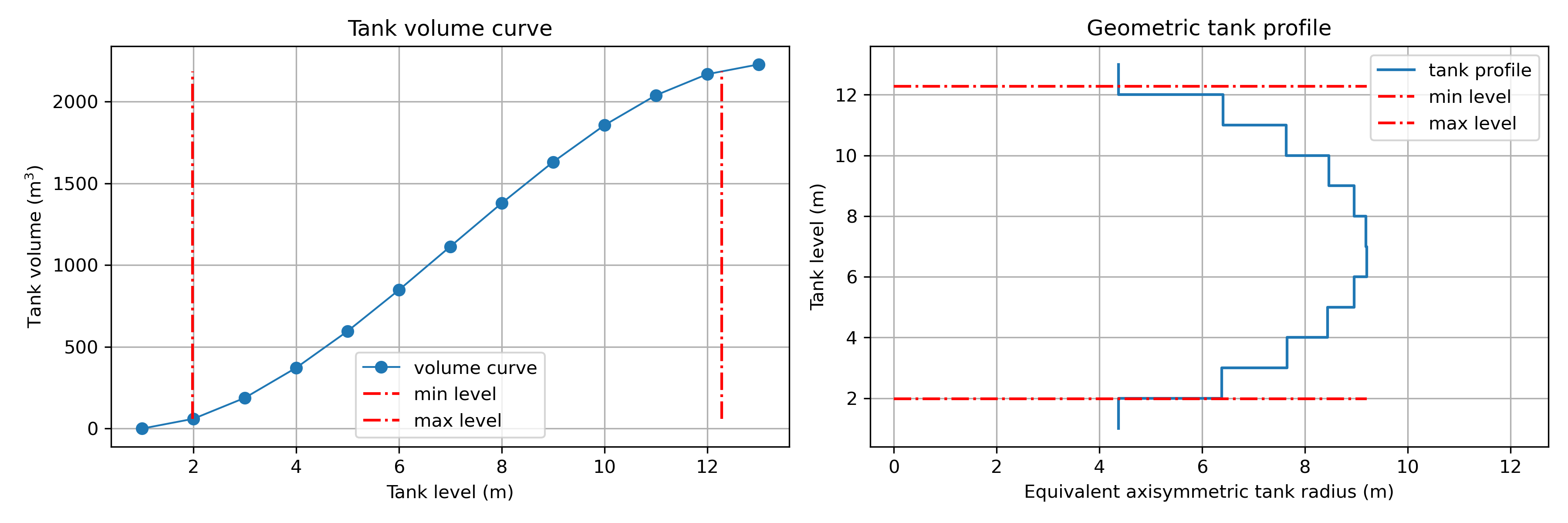
Figure 35 Tank curve and profile graphic.#
Valve layers and segments#
Valve layers and valve segment attributes can be plotted using the
function plot_valve_layer.
The following example starts by generating a valve layer and valve segments.
The valves and valve segments are plotted on the network (Figure 36).
>>> valve_layer = wntr.network.generate_valve_layer(wn, 'strategic', 2, seed=123)
>>> G = wn.to_graph()
>>> node_segments, link_segments, seg_sizes = wntr.metrics.topographic.valve_segments(G,
...     valve_layer)
>>> N = seg_sizes.shape[0]
>>> cmap = wntr.graphics.random_colormap(N) # random color map helps view segments
>>> ax = wntr.graphics.plot_network(wn, link_attribute=link_segments, node_size=0,
...     link_width=2, node_range=[0,N], link_range=[0,N], node_cmap=cmap,
...     link_cmap=cmap, link_colorbar_label='Segment ID')
>>> ax = wntr.graphics.plot_valve_layer(wn, valve_layer, add_colorbar=False,
...     include_network=False, ax=ax)
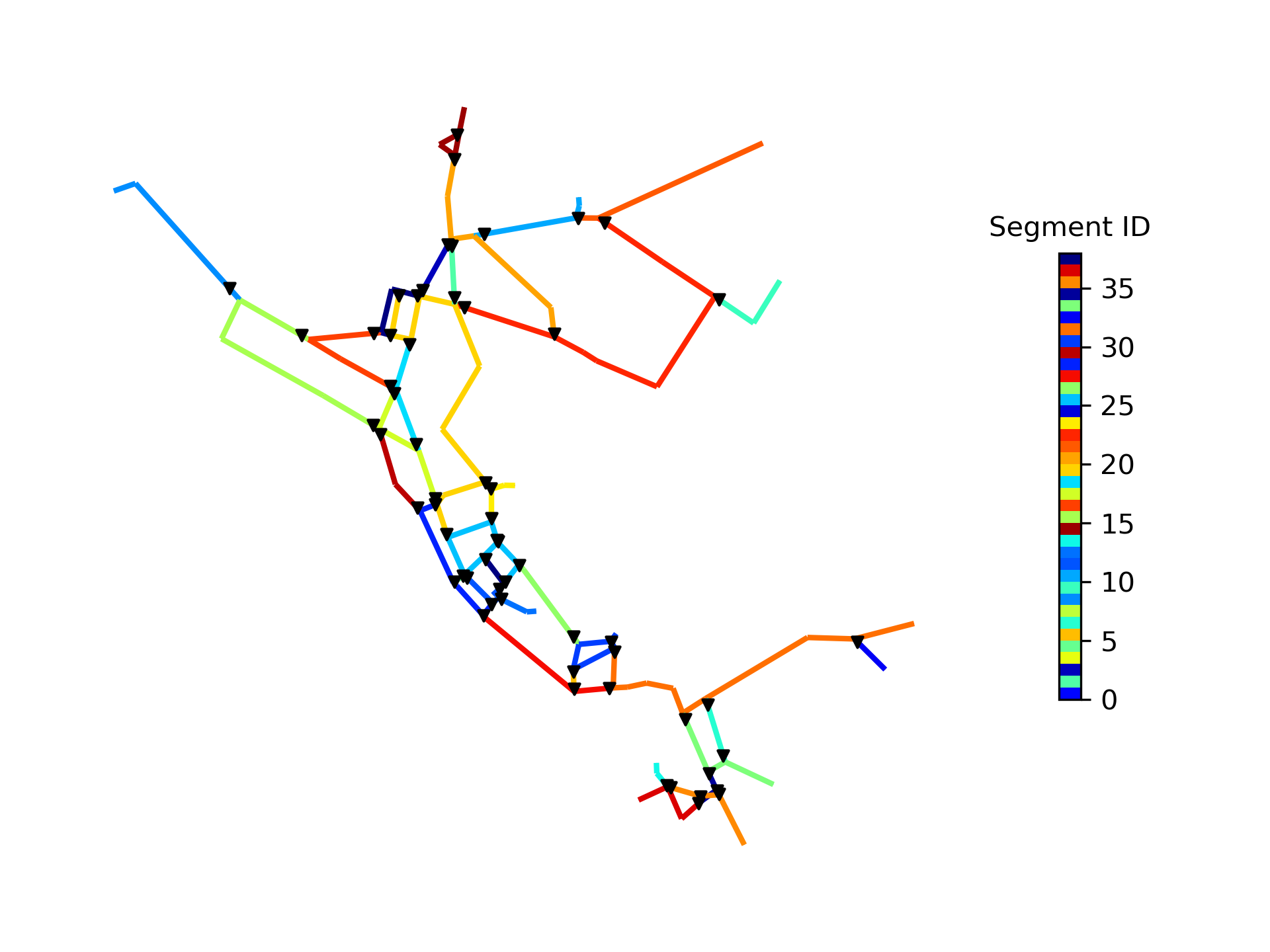
Figure 36 Valves layer and segments.#
Valve segment attributes are then computed and the number of valves surrounding each valve is plotted on the network (Figure 37).
>>> valve_attributes = wntr.metrics.valve_segment_attributes(valve_layer, node_segments,
...     link_segments)
>>> ax = wntr.graphics.plot_valve_layer(wn, valve_layer,
...     valve_attributes['num_surround'], colorbar_label='Surrounding valves')
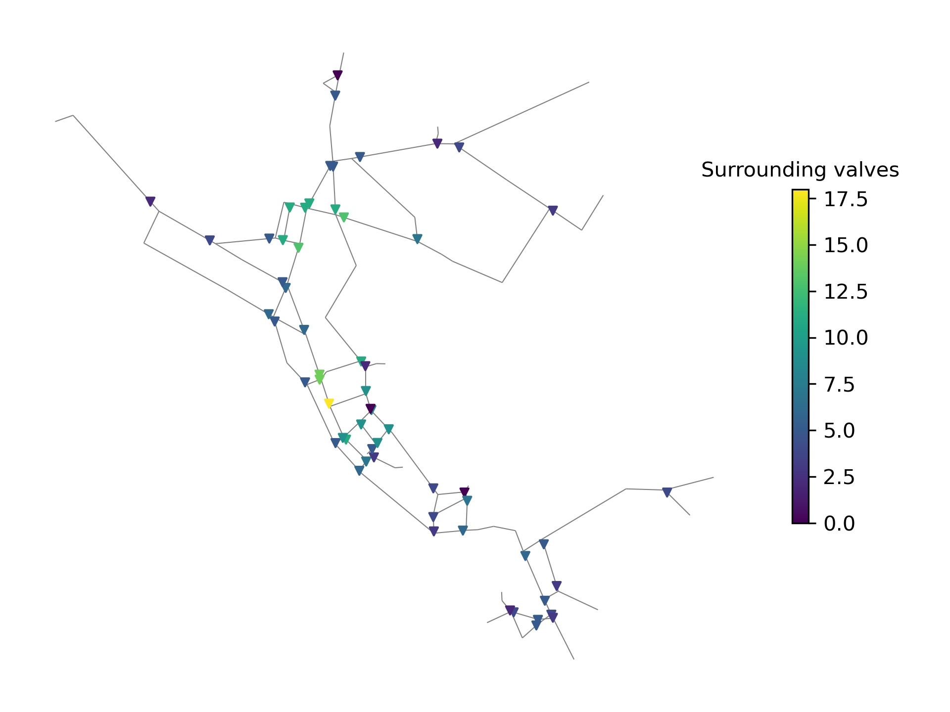
Figure 37 Valve segment attribute showing the number of valves surrounding each valve.#